This vignette will cover a variety of common applications of the eBird Status Data Products including producing maps, plotting migration chronologies, estimating the proportion of the population of a species within a region, and identifying areas of importance for a suite of species within a region. Each of these applications is chosen to highlight the value of the eBird Status Data Products for informing bird conservation and management.
Since conservation resources are finite, it’s crucial to allocate them strategically for maximum impact, ensuring resources are precisely directed to the right place at the right time. The eBird Status Data Products are particularly valuable for informing these spatiotemporal conservation decisions because they offer high spatial and temporal resolution information for a large number of species across their full global ranges.
In the introductory vignette we worked with the small example dataset for Yellow-bellied Sapsucker, which does not require a data access key to download. To provide more realistic examples, throughout this vignette we will use complete datasets for several species. As a result, a data access key is required to run the code in this vignette.
A webinar working through several of these applications is a available on YouTube.
We start by loading the packages used throughout this vignette.
library(dplyr)
library(ebirdst)
library(fields)
library(ggplot2)
library(lubridate)
library(rnaturalearth)
library(scico)
library(sf)
library(terra)
library(tidyr)
extract <- terra::extract
Mapping relative abundance
In this section, we’ll demonstrate how to make a simple map of relative abundance within a given region. As an example, we’ll make a map of breeding season relative abundance for Western Meadowlark in Montana The maps produced using this approach are suitable for many applications; however, for high-quality publication-ready maps, it may be worthwhile using a traditional GIS environment such as QGIS or ArcGIS rather than R.
We start by downloading data for Western Meadowlark and loading the
breeding season relative abundance raster. The pattern
argument to ebirdst_download_status() can be used to only
download the specific files we need.
# download seasonal relative abundance data
ebirdst_download_status("wesmea",
                        pattern = "abundance_seasonal_mean")

# load seasonal mean relative abundance at 3km resolution
abd_seasonal <- load_raster("wesmea",
                            product = "abundance",
                            period = "seasonal",
                            metric = "mean",
                            resolution = "3km")

# extract just the breeding season relative abundance
abd_breeding <- abd_seasonal[["breeding"]]
The simplest way to map the seasonal relative abundance data is to
use the built in plot() function from the
terra package.
plot(abd_breeding, axes = FALSE)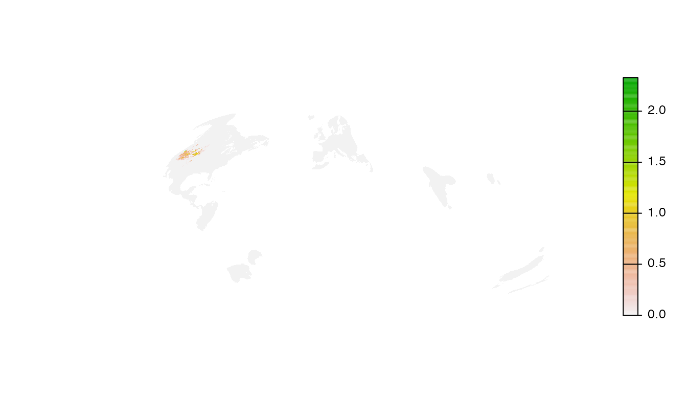
Clearly this simple approach doesn’t work very well! There are a wide variety of issues that we’ll tackle one at a time.
Cropping and masking
All raster data downloaded through this package are defined over the
same global grid, regardless of the range of the individual species. As
a result, mapping these data will produce a global map by default.
However, Western Meadowlark only occurs in the western United States,
which is barely visible in the global map. We need to constrain the
extent of our map to make it more useful. For this example, we’ll
download a boundary for Montana (a state in the United States that
harbors a large proportion of the breeding population of Western
Meadowlark) and use it to crop and mask the relative abundance data. If
you have a region defined in a Shapefile or GeoPackage you can instead
load that a polygon defining the boundary of that region using
read_sf().
# region boundary
region_boundary <- ne_states(iso_a2 = "US") |>
  filter(name == "Montana")

# project boundary to match raster data
region_boundary_proj <- st_transform(region_boundary, st_crs(abd_breeding))

# crop and mask to boundary of montana
abd_breeding_mask <- crop(abd_breeding, region_boundary_proj) |>
  mask(region_boundary_proj)

# map the cropped data
plot(abd_breeding_mask, axes = FALSE)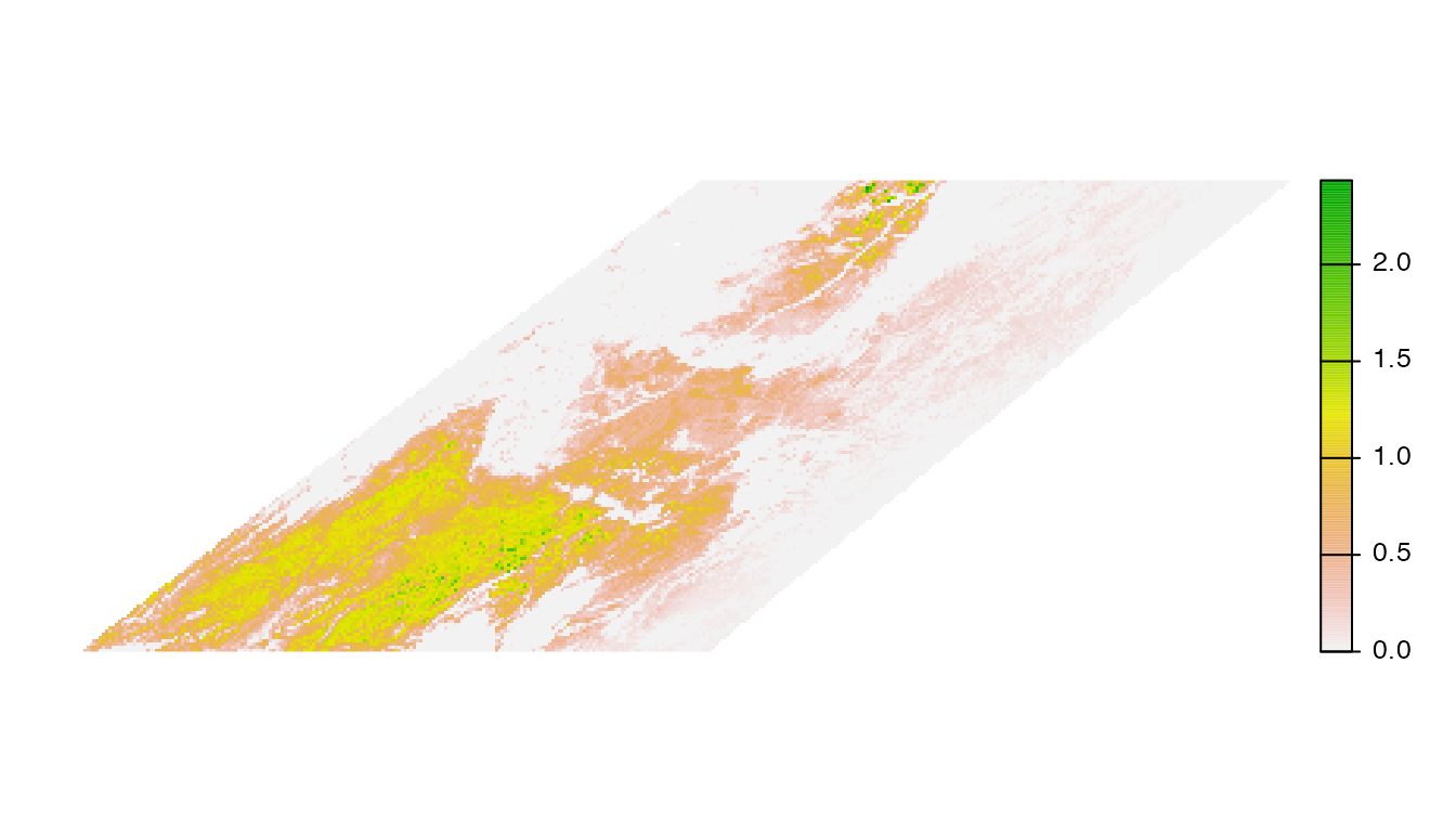
Projection
The raster data are all provided in the same equal area Earth Earth coordinate reference system. This projection is designed to work for any location on Earth; however, it is not ideal for mapping smaller regions. Instead, it’s best to select an equal area projection tailored to your region. A good general purpose choice is a Lambert’s azimuthal equal area projection centered on the focal region. This can be defined programmatically as follows.
# find the centroid of the region
region_centroid <- region_boundary |>
  st_geometry() |>
  st_transform(crs = 4326) |>
  st_centroid() |>
  st_coordinates() |>
  round(1)

# define projection
crs_laea <- paste0("+proj=laea +lat_0=", region_centroid[2],
                   " +lon_0=", region_centroid[1])

# transform to the custom projection using nearest neighbor resampling
abd_breeding_laea <- project(abd_breeding_mask, crs_laea, method = "near") |>
  # remove areas of the raster containing no data
  trim()

# map the cropped and projected data
plot(abd_breeding_laea, axes = FALSE, breakby = "cases")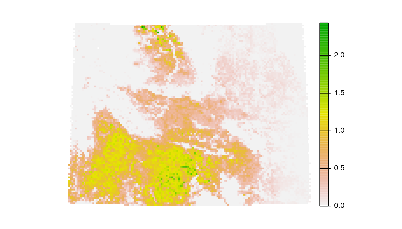
Abundance bins
The relative abundance data are not uniformly distributed, which can
lead to challenges distinguishing areas of differing levels of
abundance. This is especially true for highly aggregatory species like
shorebirds and ducks. To address this, we’ll use a quantile bins for the
map, where each color in the legend corresponds to an equal number of
cells in the raster. We’ll define these bins excluding zeros, then
assign a separate color to the zeros. We can also use the function
abundance_palette() to get the same set of colors we use in
the legends on the eBird Status and Trends website.
# quantiles of non-zero values
v <- values(abd_breeding_laea, na.rm = TRUE, mat = FALSE)
v <- v[v > 0]
breaks <- quantile(v, seq(0, 1, by = 0.1))
# add a bin for 0
breaks <- c(0, breaks)

# status and trends palette
pal <- ebirdst_palettes(length(breaks) - 2)
# add a color for zero
pal <- c("#e6e6e6", pal)

# map using the quantile bins
plot(abd_breeding_laea, breaks = breaks, col = pal, axes = FALSE)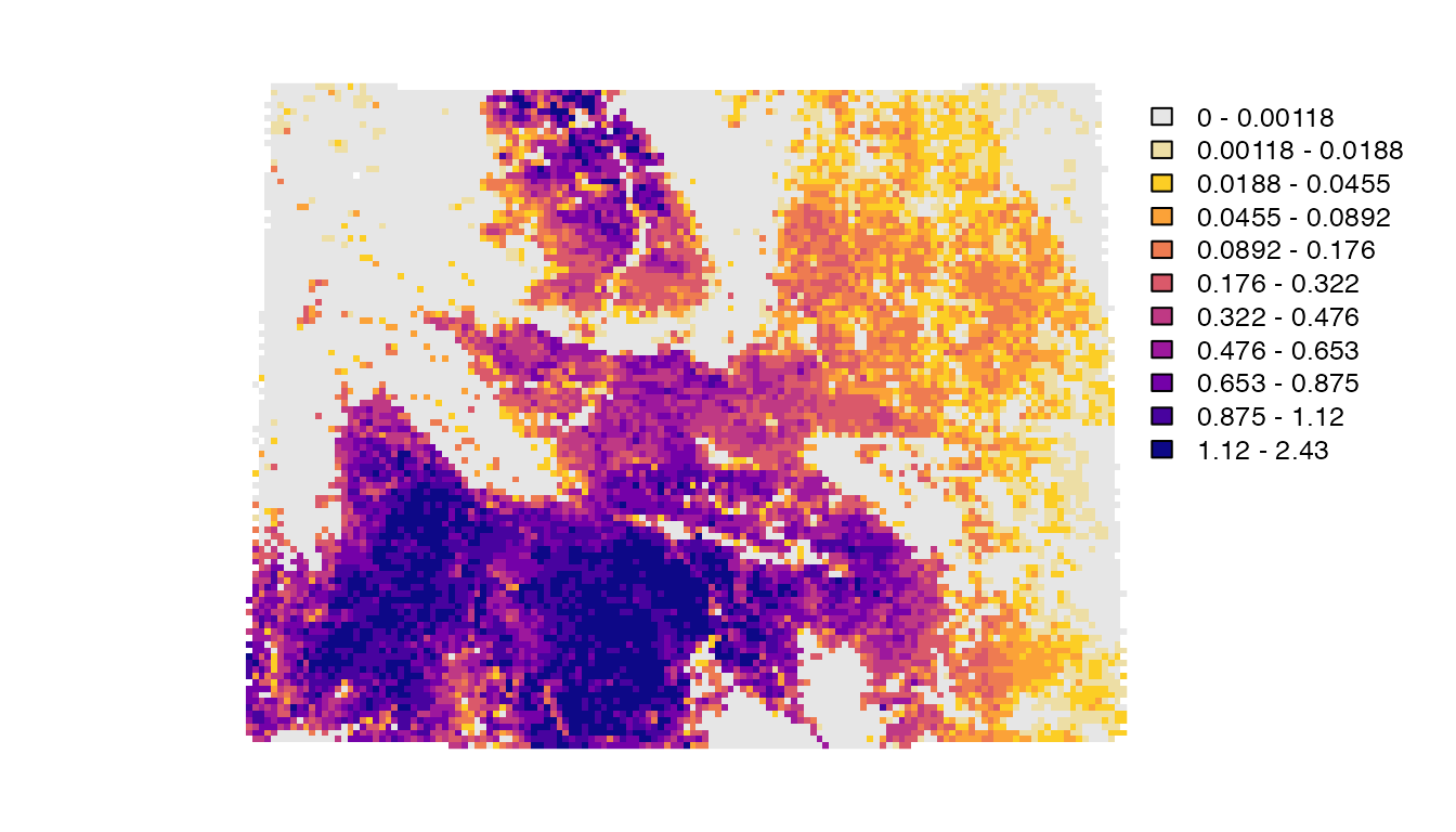
Basemap
Finally, we’ll add state and country boundaries to provide some
context and generate a nicer legend. The R package
rnaturalearth is an excellent source of attribution free
contextual GIS data.
# natural earth boundaries
countries <- ne_countries(returnclass = "sf") |>
  st_geometry() |>
  st_transform(crs_laea)
states <- ne_states(iso_a2 = "US") |>
  st_geometry() |>
  st_transform(crs_laea)

# define the map plotting extent with the region boundary polygon
region_boundary_laea <- region_boundary |>
  st_geometry() |>
  st_transform(crs_laea)
plot(region_boundary_laea)
# add basemap
plot(countries, col = "#cfcfcf", border = "#888888", add = TRUE)
# add relative abundance
plot(abd_breeding_laea,
     breaks = breaks, col = pal,
     maxcell = ncell(abd_breeding_laea),
     legend = FALSE, add = TRUE)
# add boundaries
lines(vect(countries), col = "#ffffff", lwd = 3)
lines(vect(states), col =  "#ffffff", lwd = 1.5, xpd = TRUE)
lines(vect(region_boundary_laea), col = "#ffffff", lwd = 3, xpd = TRUE)

# add legend using the fields package
# label the bottom, middle, and top
labels <- quantile(breaks, c(0, 0.5, 1))
label_breaks <- seq(0, 1, length.out = length(breaks))
image.plot(zlim = c(0, 1), breaks = label_breaks, col = pal,
           smallplot = c(0.90, 0.93, 0.15, 0.85),
           legend.only = TRUE,
           axis.args = list(at = c(0, 0.5, 1),
                            labels = round(labels, 2),
                            col.axis = "black", fg = NA,
                            cex.axis = 0.9, lwd.ticks = 0,
                            line = -0.5))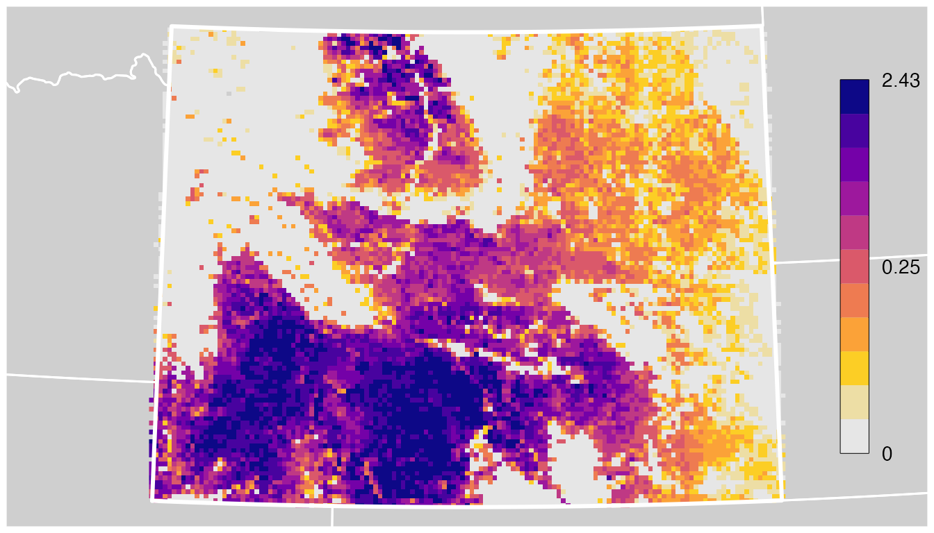
Migration chronologies
Goal: generate migration chronologies for a set of species within a region to investigate how use of the region changes throughout the year for different species. This information can be used to inform the optimal time of year to make temporally specific conservation investments. For an example of this type of conservation intervention, see the California Bird Returns project.
In this application we’ll use the weekly estimates to chart the change in relative abundance throughout the year for a given region. These migration chronologies can be useful for identifying when a given geography receives the highest intensity of use by a species or group of species.
We’ll start by generating a chronology with confidence intervals for a single species, then demonstrate how to produce multi-species chronologies. For these examples, we’ll consider grassland birds in Montana. To start we’ll load a polygon for the boundary of Montana.
Single species with uncertainty
For the single species example, let’s chart a migration chronology for Western Meadowlark in Montana. First we need to download and load the relevant eBird Status Data Products for this species: the weekly median relative abundance and the upper and lower confidence intervals of weekly relative abundance.
# download data if they haven't already been downloaded
# only weekly 3km relative abundance, median and confidence limits
ebirdst_download_status("Western Meadowlark",
pattern = "abundance_(median|upper|lower)_3km")
# load the median weekly relative abundance and lower/upper confidence limits
abd_median <- load_raster("wesmea", product = "abundance", metric = "median")
abd_lower <- load_raster("wesmea", product = "abundance", metric = "lower")
abd_upper <- load_raster("wesmea", product = "abundance", metric = "upper")
# project region boundary to match raster data
region_boundary_proj <- st_transform(region_boundary, st_crs(abd_median))Now we can calculate the mean relative abundance with confidence
intervals for each week of the year within Montana The
extract() function extracts all the raster cells values
within a given polygon, then summarizes these values using a
user-provided function.
# extract values within region and calculate the mean
abd_median_region <- extract(abd_median, region_boundary_proj,
fun = "mean", na.rm = TRUE, ID = FALSE)
abd_lower_region <- extract(abd_lower, region_boundary_proj,
fun = "mean", na.rm = TRUE, ID = FALSE)
abd_upper_region <- extract(abd_upper, region_boundary_proj,
fun = "mean", na.rm = TRUE, ID = FALSE)
# transform to data frame format with rows corresponding to weeks
chronology <- data.frame(week = as.Date(names(abd_median)),
median = as.numeric(abd_median_region),
lower = as.numeric(abd_lower_region),
upper = as.numeric(abd_upper_region))Finally, let’s use this data frame to generate a migration chronology for this species.
ggplot(chronology) +
aes(x = week, y = median) +
geom_ribbon(aes(ymin = lower, ymax = upper), alpha = 0.2) +
geom_line() +
scale_x_date(date_labels = "%b", date_breaks = "1 month") +
labs(x = "Week",
y = "Mean relative abundance in Montana",
title = "Migration chronology for Western Meadowlark in Montana")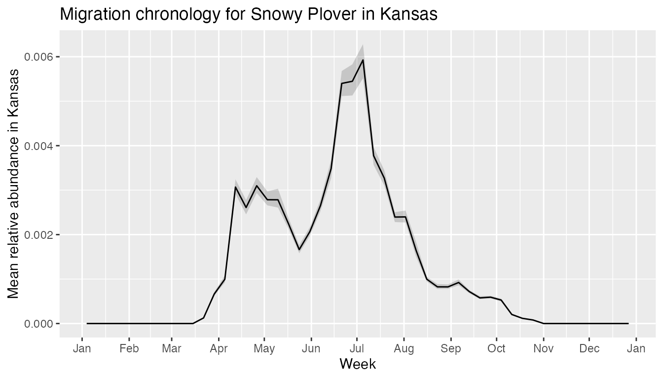
Multi-species
Migration chronologies can also be overlaid for multiple species, allowing for comparison of migration timing between species. However, comparing eBird Status Data Products across species requires extra caution because the models give relative rather than absolute abundance. For example, species differ in their detectability, and this may cause differences in relative abundance. To address this, rather than use the relative abundance within Kansas, we’ll calculate the proportion of the global modeled population falling within Kansas. Since proportion of population is a ratio of relative abundance values, it helps to control for difference in detectability, allowing us to compare multiple species.
Following a similar approach to that used for the single species chronology above, we’ll estimate migration chronologies for a suite of grassland species in Montana. However, in this example we’ll estimate the proportion of population falling within Montana rather than the mean abundance.
grassland_species <- c("Baird's Sparrow",
"Bobolink",
"Chestnut-collared Longspur",
"Sprague's Pipit",
"Upland Sandpiper",
"Western Meadowlark")
chronologies <- NULL
for (species in grassland_species) {
# download weekly 27km relative abundance, median and confidence limits
ebirdst_download_status(species,
pattern = "abundance_(median|upper|lower)_3km")
# load the median weekly relative abundance and lower/upper confidence limits
abd_median <- load_raster(species)
abd_lower <- load_raster(species, metric = "lower")
abd_upper <- load_raster(species, metric = "upper")
# total relative abundance across the entire modeled range of the species
abd_total <- global(abd_median, fun = sum, na.rm = TRUE)$sum
# total abundance within the region of interest
abd_median_region <- extract(abd_median, region_boundary_proj,
fun = "sum", na.rm = TRUE, ID = FALSE)
abd_lower_region <- extract(abd_lower, region_boundary_proj,
fun = "sum", na.rm = TRUE, ID = FALSE)
abd_upper_region <- extract(abd_upper, region_boundary_proj,
fun = "sum", na.rm = TRUE, ID = FALSE)
# proportion of population within the region of interest
prop_pop_median <- as.numeric(abd_median_region) / abd_total
prop_pop_lower <- as.numeric(abd_lower_region) / abd_total
prop_pop_upper <- as.numeric(abd_upper_region) / abd_total
# transform to data frame format with rows corresponding to weeks
chronology <- data.frame(species = species,
week = as.Date(names(abd_median)),
median = prop_pop_median,
lower = prop_pop_lower,
upper = pmin(prop_pop_upper, 1))
# combine with other species
chronologies <- bind_rows(chronologies, chronology)
}Finally, we can use this data frame to generate migration chronologies for these species.
ggplot(chronologies) +
aes(x = week, y = median, color = species, fill = species) +
geom_ribbon(aes(ymin = lower, ymax = upper), color = NA, alpha = 0.2) +
geom_line(linewidth = 1) +
scale_x_date(date_labels = "%b", date_breaks = "1 month") +
scale_y_continuous(labels = scales::label_percent()) +
scale_color_brewer(palette = "Set1") +
scale_fill_brewer(palette = "Set1") +
labs(x = NULL,
y = "Percent of population in Montana",
title = "Migration chronologies for grassland birds in Montana",
color = NULL, fill = NULL) +
theme(legend.position = "bottom")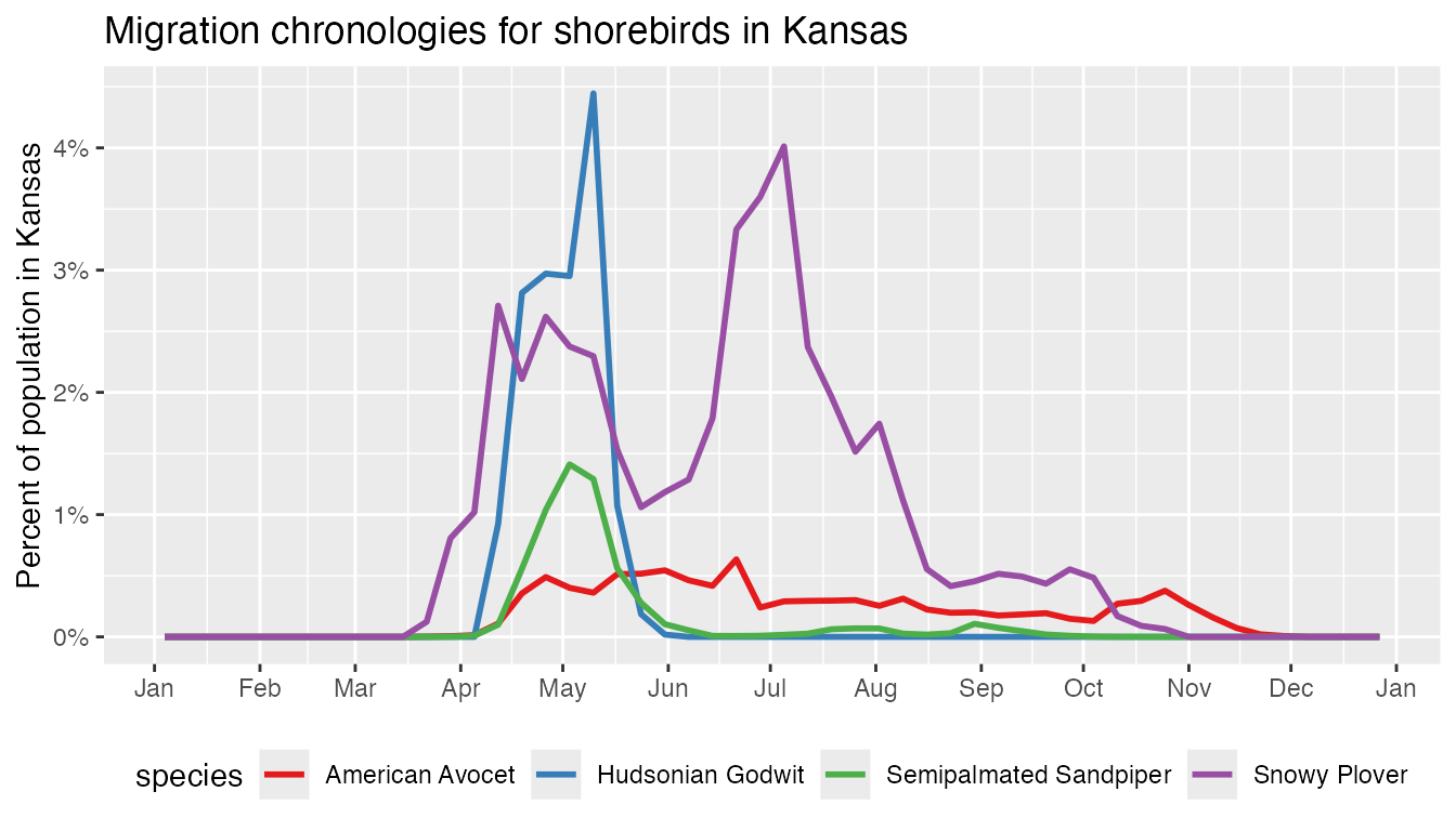
A variety of patterns are revealed in this migration chronology. Several of the grassland species (e.g., Baird’s Sparrow) have more than 30% of their breeding populations entirely within the state of Montana. Timing of arrival and departure varies between species, with Western Meadowlark spending the longest amount of time in the state and Bobolink spending the least amount of time.
Finally, Sprague’s Pipit deserves special attention: there’s a huge spike in proportion of population during post-breeding migration. Is this a true reflection of the ecology of this species or an issue with the model estimates? It’s important to bring a critical eye to outliers in the data and ask these questions. In this particular case, looking at the weekly maps on the eBird Status and Trends website for the end of August reveals that the species appears to almost completely disappears for a couple weeks. Sprague’s Pipit is quite challenging to detect during migration and it appears the models are struggling to pick up a signal, resulting in estimates that are missing large parts of the population. We’ve included this species as a remind to instigate any irregularities in the estimates you discover and consult an expert on the species if needed.
Regional proportion of population
Goal: identify the proportion of a species’ population falling within a given region. This information can be used to highlight stewardship responsibility for a species, for example, if a large proportion of a species’ breeding populaiton falls within a region, that region could be said to have a high stewardship responsibility for that species.
The eBird Status and Trends website provides regional summary statistics at the country and state/province level for each species. For example, we can use the regional stats to see that 33% of the non-breeding population of Golden Eagle falls within the United States. The website also allows users to draw their own customs polygons to get summary statistics within these polygons. However, there are cases where you may want to estimate regional summary statistics in a way that isn’t supported by the website. Here we’ll provide a few examples for calculating the proportion of population within a region. We’ll use Golden Eagle for these examples.
ebirdst_download_status("Golden Eagle")Proportion of seasonal population
For this example, we’ll estimate the seasonal proportion of the population of Golden Eagle within each state in the United States. Note that Golden Eagles are distributed throughout the Northern Hemisphere, in North America, Asia, and Europe. In this example, we’ll be estimating the proportion of the global population, in the next example we’ll estimate the proportion of the North American population.
To start, we’ll load the seasonal proportion of population raster
layers and polygons defining each state. If you have a Shapefile or
GeoPackage defining your region of interest (e.g., for a protected area
or Bird Conservation Region), you could load it here using the
read_sf() function.
# seasonal proportion of population
prop_pop_seasonal <- load_raster("goleag",
product = "proportion-population",
period = "seasonal")
# state boundaries, excluding hawaii
states <- ne_states(iso_a2 = "US") |>
filter(name != "Hawaii") |>
select(state = name) |>
# transform to match projection of raster data
st_transform(crs = st_crs(prop_pop_seasonal))Now we can use the extract() function from
terra to calculate the proportion of the population within
each state for each season. Setting weights = TRUE triggers
extract() to calculate a weighted sum to account for
partial coverage of raster cells by the region polygons. In this
example, the weights argument has little impact, but it can
play a more important role for smaller regions.
state_prop_pop <- extract(prop_pop_seasonal, states,
fun = "sum", na.rm = TRUE, weights = TRUE,
bind = TRUE) |>
as.data.frame() |>
# sort in descending order or breeding proportion of population
arrange(desc(breeding))
#> |---------|---------|---------|---------|========================================= |---------|---------|---------|---------|========================================= |---------|---------|---------|---------|========================================= |---------|---------|---------|---------|========================================= |---------|---------|---------|---------|========================================= |---------|---------|---------|---------|========================================= |---------|---------|---------|---------|========================================= |---------|---------|---------|---------|========================================= |---------|---------|---------|---------|========================================= |---------|---------|---------|---------|========================================= |---------|---------|---------|---------|========================================= |---------|---------|---------|---------|========================================= |---------|---------|---------|---------|========================================= |---------|---------|---------|---------|========================================= |---------|---------|---------|---------|========================================= |---------|---------|---------|---------|========================================= |---------|---------|---------|---------|========================================= |---------|---------|---------|---------|========================================= |---------|---------|---------|---------|========================================= |---------|---------|---------|---------|========================================= |---------|---------|---------|---------|========================================= |---------|---------|---------|---------|========================================= |---------|---------|---------|---------|========================================= |---------|---------|---------|---------|========================================= |---------|---------|---------|---------|========================================= |---------|---------|---------|---------|========================================= |---------|---------|---------|---------|========================================= |---------|---------|---------|---------|========================================= |---------|---------|---------|---------|========================================= |---------|---------|---------|---------|========================================= |---------|---------|---------|---------|========================================= |---------|---------|---------|---------|========================================= |---------|---------|---------|---------|========================================= |---------|---------|---------|---------|========================================= |---------|---------|---------|---------|========================================= |---------|---------|---------|---------|========================================= |---------|---------|---------|---------|========================================= |---------|---------|---------|---------|========================================= |---------|---------|---------|---------|========================================= |---------|---------|---------|---------|========================================= |---------|---------|---------|---------|========================================= |---------|---------|---------|---------|========================================= |---------|---------|---------|---------|========================================= |---------|---------|---------|---------|========================================= |---------|---------|---------|---------|========================================= |---------|---------|---------|---------|========================================= |---------|---------|---------|---------|========================================= |---------|---------|---------|---------|========================================= |---------|---------|---------|---------|========================================= |---------|---------|---------|---------|========================================= |---------|---------|---------|---------|========================================= |---------|---------|---------|---------|========================================= |---------|---------|---------|---------|========================================= |---------|---------|---------|---------|========================================= |---------|---------|---------|---------|========================================= |---------|---------|---------|---------|========================================= |---------|---------|---------|---------|========================================= |---------|---------|---------|---------|========================================= |---------|---------|---------|---------|========================================= |---------|---------|---------|---------|========================================= |---------|---------|---------|---------|========================================= |---------|---------|---------|---------|========================================= |---------|---------|---------|---------|========================================= |---------|---------|---------|---------|========================================= |---------|---------|---------|---------|========================================= |---------|---------|---------|---------|========================================= |---------|---------|---------|---------|========================================= |---------|---------|---------|---------|========================================= |---------|---------|---------|---------|========================================= |---------|---------|---------|---------|========================================= |---------|---------|---------|---------|========================================= |---------|---------|---------|---------|========================================= |---------|---------|---------|---------|========================================= |---------|---------|---------|---------|========================================= |---------|---------|---------|---------|========================================= |---------|---------|---------|---------|========================================= |---------|---------|---------|---------|========================================= |---------|---------|---------|---------|========================================= |---------|---------|---------|---------|========================================= |---------|---------|---------|---------|========================================= |---------|---------|---------|---------|========================================= |---------|---------|---------|---------|========================================= |---------|---------|---------|---------|========================================= |---------|---------|---------|---------|========================================= |---------|---------|---------|---------|========================================= |---------|---------|---------|---------|========================================= |---------|---------|---------|---------|========================================= |---------|---------|---------|---------|========================================= |---------|---------|---------|---------|========================================= |---------|---------|---------|---------|========================================= |---------|---------|---------|---------|========================================= |---------|---------|---------|---------|========================================= |---------|---------|---------|---------|========================================= |---------|---------|---------|---------|========================================= |---------|---------|---------|---------|========================================= |---------|---------|---------|---------|========================================= |---------|---------|---------|---------|========================================= |---------|---------|---------|---------|========================================= |---------|---------|---------|---------|========================================= |---------|---------|---------|---------|=========================================
head(state_prop_pop)
#> state breeding nonbreeding prebreeding_migration
#> 1 Alaska 0.07868446 9.979945e-05 0.198995523
#> 2 Wyoming 0.02749171 4.757064e-02 0.026007670
#> 3 Montana 0.02354169 5.629944e-02 0.026315816
#> 4 Utah 0.01155014 3.725202e-02 0.016403725
#> 5 Nevada 0.01102989 3.515999e-02 0.015289441
#> 6 California 0.01018862 2.247653e-02 0.009888532
#> postbreeding_migration
#> 1 0.07670290
#> 2 0.02503700
#> 3 0.03123912
#> 4 0.01270763
#> 5 0.01244097
#> 6 0.00955948Proportion of North American population
For broadly distributed species, such as Golden Eagle, it may be desirable to estimate the proportion of the population relative to a subset of the full range. For example, let’s calculate the proportion of the North American population within each state, where we define North America to include the United States, Canada, and Mexico. We’ll start by creating a polygon for the boundary of North America, using this to mask the seasonal relative abundance raster, then dividing the masked relative abundance raster by the total relative abundance across all of North America to generate layers showing the proportion of North American population.
# seasonal relative abundance
abd_seasonal <- load_raster("goleag",
product = "abundance",
period = "seasonal")
# load country polygon, union into a single polygon, and project
noram <- ne_countries(country = c("United States of America",
"Canada", "Mexico")) |>
st_union() |>
st_transform(crs = st_crs(abd_seasonal)) |>
# vect converts an sf object to terra format for mask()
vect()
# mask seasonal abundance
abd_seasonal_noram <- mask(abd_seasonal, noram)
#> |---------|---------|---------|---------|=========================================
# total north american relative abundance for each season
abd_noram_total <- global(abd_seasonal_noram, fun = "sum", na.rm = TRUE)
# proportion of north american population
prop_pop_noram <- abd_seasonal_noram / abd_noram_total$sum
#> |---------|---------|---------|---------|========================================= Now we can calculate the proportion of population using exactly the same method as in the previous section.
state_prop_noram_pop <- extract(prop_pop_noram, states,
fun = "sum", na.rm = TRUE, weights = TRUE,
bind = TRUE) |>
as.data.frame() |>
# sort in descending order or breeding proportion of population
arrange(desc(breeding))
#> |---------|---------|---------|---------|========================================= |---------|---------|---------|---------|========================================= |---------|---------|---------|---------|========================================= |---------|---------|---------|---------|========================================= |---------|---------|---------|---------|========================================= |---------|---------|---------|---------|========================================= |---------|---------|---------|---------|========================================= |---------|---------|---------|---------|========================================= |---------|---------|---------|---------|========================================= |---------|---------|---------|---------|========================================= |---------|---------|---------|---------|========================================= |---------|---------|---------|---------|========================================= |---------|---------|---------|---------|========================================= |---------|---------|---------|---------|========================================= |---------|---------|---------|---------|========================================= |---------|---------|---------|---------|========================================= |---------|---------|---------|---------|========================================= |---------|---------|---------|---------|========================================= |---------|---------|---------|---------|========================================= |---------|---------|---------|---------|========================================= |---------|---------|---------|---------|========================================= |---------|---------|---------|---------|========================================= |---------|---------|---------|---------|========================================= |---------|---------|---------|---------|========================================= |---------|---------|---------|---------|========================================= |---------|---------|---------|---------|========================================= |---------|---------|---------|---------|========================================= |---------|---------|---------|---------|========================================= |---------|---------|---------|---------|========================================= |---------|---------|---------|---------|========================================= |---------|---------|---------|---------|========================================= |---------|---------|---------|---------|========================================= |---------|---------|---------|---------|========================================= |---------|---------|---------|---------|========================================= |---------|---------|---------|---------|========================================= |---------|---------|---------|---------|========================================= |---------|---------|---------|---------|========================================= |---------|---------|---------|---------|========================================= |---------|---------|---------|---------|========================================= |---------|---------|---------|---------|========================================= |---------|---------|---------|---------|========================================= |---------|---------|---------|---------|========================================= |---------|---------|---------|---------|========================================= |---------|---------|---------|---------|========================================= |---------|---------|---------|---------|========================================= |---------|---------|---------|---------|========================================= |---------|---------|---------|---------|========================================= |---------|---------|---------|---------|========================================= |---------|---------|---------|---------|========================================= |---------|---------|---------|---------|========================================= |---------|---------|---------|---------|========================================= |---------|---------|---------|---------|========================================= |---------|---------|---------|---------|========================================= |---------|---------|---------|---------|========================================= |---------|---------|---------|---------|========================================= |---------|---------|---------|---------|========================================= |---------|---------|---------|---------|========================================= |---------|---------|---------|---------|========================================= |---------|---------|---------|---------|========================================= |---------|---------|---------|---------|========================================= |---------|---------|---------|---------|========================================= |---------|---------|---------|---------|========================================= |---------|---------|---------|---------|========================================= |---------|---------|---------|---------|========================================= |---------|---------|---------|---------|========================================= |---------|---------|---------|---------|========================================= |---------|---------|---------|---------|========================================= |---------|---------|---------|---------|========================================= |---------|---------|---------|---------|========================================= |---------|---------|---------|---------|========================================= |---------|---------|---------|---------|========================================= |---------|---------|---------|---------|========================================= |---------|---------|---------|---------|========================================= |---------|---------|---------|---------|========================================= |---------|---------|---------|---------|========================================= |---------|---------|---------|---------|========================================= |---------|---------|---------|---------|========================================= |---------|---------|---------|---------|========================================= |---------|---------|---------|---------|========================================= |---------|---------|---------|---------|========================================= |---------|---------|---------|---------|========================================= |---------|---------|---------|---------|========================================= |---------|---------|---------|---------|========================================= |---------|---------|---------|---------|========================================= |---------|---------|---------|---------|========================================= |---------|---------|---------|---------|========================================= |---------|---------|---------|---------|========================================= |---------|---------|---------|---------|========================================= |---------|---------|---------|---------|========================================= |---------|---------|---------|---------|========================================= |---------|---------|---------|---------|========================================= |---------|---------|---------|---------|========================================= |---------|---------|---------|---------|========================================= |---------|---------|---------|---------|========================================= |---------|---------|---------|---------|========================================= |---------|---------|---------|---------|========================================= |---------|---------|---------|---------|========================================= |---------|---------|---------|---------|========================================= |---------|---------|---------|---------|========================================= |---------|---------|---------|---------|=========================================
head(state_prop_noram_pop)
#> state breeding nonbreeding prebreeding_migration
#> 1 Alaska 0.28015381 0.0002490995 0.37901331
#> 2 Wyoming 0.09848225 0.1236457195 0.04958722
#> 3 Montana 0.08433231 0.1463336442 0.05017475
#> 4 Utah 0.04137551 0.0968255492 0.03127597
#> 5 Nevada 0.03951184 0.0913879306 0.02915144
#> 6 California 0.03645739 0.0583876464 0.01884387
#> postbreeding_migration
#> 1 0.19813731
#> 2 0.06488325
#> 3 0.08095603
#> 4 0.03293174
#> 5 0.03224071
#> 6 0.02475229Notice that the proportions are higher than those in the previous section since we’re now estimating the proportion of the North American population rather than the proportion of the global population. For example, 6% of the global breeding season population occurs in Alaska, but this corresponds to 24% of the North American breeding season population.
Regional stats for weeks and custom time periods
The eBird Status Data Products include seasonal raster layers that are derived from the weekly rasters based on expert defined seasons. These seasonal layers are convenient to work with, however, in some cases you may want to estimate the proportion of the population within a region at the weekly level or for a custom time period. For example, let’s estimate the proportion of the North American population within California by week and for the month of January.
For this example, we’ll use the lower, 27 km resolution data in the interest of speed, since the 3 km weekly data can be quite slow to process. We’ll start by estimating the weekly proportion of the North American population following an approach similar to that in the previous section.
# weekly relative abundance, masked to north america
abd_weekly_noram <- load_raster("goleag",
product = "abundance",
resolution = "27km") |>
mask(noram)
# total north american relative abundance for each week
abd_weekly_total <- global(abd_weekly_noram, fun = "sum", na.rm = TRUE)
# proportion of north american population
prop_pop_weekly_noram <- abd_weekly_noram / abd_weekly_total$sum
# proportion of weekly population in california
california <- filter(states, state == "California")
cali_prop_noram_pop <- extract(prop_pop_weekly_noram, california,
fun = "sum", na.rm = TRUE,
weights = TRUE, ID = FALSE)
prop_pop_weekly_noram <- data.frame(
week = as.Date(names(cali_prop_noram_pop)),
prop_pop = as.numeric(cali_prop_noram_pop[1, ]))
head(prop_pop_weekly_noram)
#> week prop_pop
#> 1 2023-01-04 0.06030753
#> 2 2023-01-11 0.05464490
#> 3 2023-01-18 0.05554418
#> 4 2023-01-25 0.05549314
#> 5 2023-02-01 0.05697462
#> 6 2023-02-08 0.06049768This data frame gives the weekly proportion of the North American population of Golden Eagle in California; the structure is very similar to the data we generated in the migration chronology section. We can take this one step further and average the proportion of population across the weeks in the month of January.
Coastal species
There is one particular case where the methods we have presented so far for regional statistics can cause issues: species with a significant proportion of their population in offshore or tidal areas. Many regional polygons, including those from Natural Earth used so far, only capture the land area, resulting in a large proportion of non-zero relative abundance cells falling outside the polygons. For example, let’s estimate the proportion of the global non-breeding season population of Surf Scoter in Mexico using the naive approach used in the previous examples.
# download only the season proportion of population layer
ebirdst_download_status("Surf Scoter",
pattern = "proportion-population_seasonal_mean_3km")
# breeding season proportion of population
abd_nonbreeding <- load_raster("Surf Scoter",
product = "proportion-population",
period = "seasonal") |>
subset("nonbreeding")
# load a polygon for the boundary of Mexico
mexico <- ne_countries(country = "Mexico") |>
st_transform(crs = st_crs(abd_nonbreeding))
# proportion in mexico
extract(abd_nonbreeding, mexico, fun = "sum", na.rm = TRUE, ID = FALSE)
#> nonbreeding
#> 1 0.06253108According to this method, about 20% of the non-breeding population of
Surf Scoter occurs in Mexico. However, Surf Scoter is an exclusively
coastal species and this naive estimate is missing a large part of the
population because the coarse boundary for Mexico we’re using doesn’t
capture many of the 3 km raster cells that are falling offshore. We can
correct for this by buffering the Mexico polygon by 5 km to try to
capture these coastal cells. We’ll also use touches = TRUE
to include raster cells that are touched by the Mexico polygon; without
that argument, only cells whose centers fall within the Mexico polygon
will be included.
# buffer by 5000m = 5km
mexico_buffer <- st_buffer(mexico, dist = 5000)
# proportion in mexico
extract(abd_nonbreeding, mexico_buffer, fun = "sum", na.rm = TRUE,
touches = TRUE, ID = FALSE)
#> nonbreeding
#> 1 0.07994288With these adjustments the proportion of the population has increased substantially from 20% to 33%. These approaches are not perfect and care should always be taken when working with eBird Status and Trends Data Products for coastal species.
Areas of importance
Goal: identify areas of highest importance for a set of species within a region. This information can be used to identify areas to prioritize for protection or other conservation interventions.
eBird Status Data Products can used to identify areas of importance for a species or group of species, which can help prioritize areas for protection or other conservation interventions. In this context, “areas of importance” refer to those areas within the landscape that have a higher concentration of the given species. For this application, we’ll use the same set of grassland species in Montana during the breeding season as we used for the migration chronology example.
# species list
grassland_species <- c("Baird's Sparrow",
"Bobolink",
"Chestnut-collared Longspur",
"Sprague's Pipit",
"Upland Sandpiper",
"Western Meadowlark")
# region boundary
region_boundary <- ne_states(iso_a2 = "US") |>
filter(name == "Montana") |>
st_transform(st_crs(abd_breeding)) |>
vect()Richness
The simplest approach to identifying important areas is to generate a richness map showing the number of species falling within each 3 km grid cell. We’ll start by converting the relative abundance rasters to binary presence-absence rasters for each species within the region of interest by converting any non-zero abundance values to one. Then we calculate a cell-wise sum across the binary rasters for each species to generate a richness raster.
range_rasters <- list()
for (species in grassland_species) {
  # download seasonal abundance at 3km
  ebirdst_download_status(species, pattern = "abundance_seasonal_mean_3km")

  # load breeding season relative abundance
  abd <- load_raster(species, period = "seasonal") |>
    subset("breeding")
  # crop and mask to region
  abd_masked <- mask(crop(abd, region_boundary), region_boundary)
  # convert to binary, presence-absence
  range_rasters[[species]] <- abd_masked > 0
}
# sum across species to calculate richness
richness <- sum(rast(range_rasters), na.rm = TRUE)
Then we can make a simple map that shows the number of species (out of six total) that occur within each 3 km grid cell.
# make a simple map
plot(richness, axes = FALSE)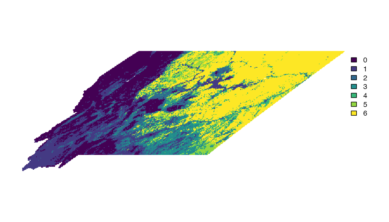
Importance
The richness map generated in the previous section is intuitive and gives a general sense of where grassland species are occurring within Montana. However, presence-absence is a coarse metric: species may occur at dramatically different densities from location to location and, in general, it’s most strategic to invest conservation resources in areas with higher concentrations of the target species. We can take full advantage of the relative abundance estimates to generate an importance metric that is much more granular than richness.
Recall that when combining estimates across species it’s important to use proportion of population rather than relative abundance to account for differences in the detection process. So, we’ll load the pre-generated proportion of population rasters for each species, then average them across species to produce a metric of importance.
prop_pop <- list()
for (species in grassland_species) {
  # download seasonal abundance at 3km
  ebirdst_download_status(species,
                          pattern = "proportion-population_seasonal_mean_3km")

  # load breeding season proportion of population
  pp <- load_raster(species,
                    product = "proportion-population",
                    period = "seasonal") |>
    subset("breeding")
  # crop and mask to region
  prop_pop[[species]] <- mask(crop(pp, region_boundary), region_boundary)
}
# take mean across species
importance <- mean(rast(prop_pop), na.rm = TRUE)
Now let’s make a simple map of this importance metric.
plot(importance, axes = FALSE)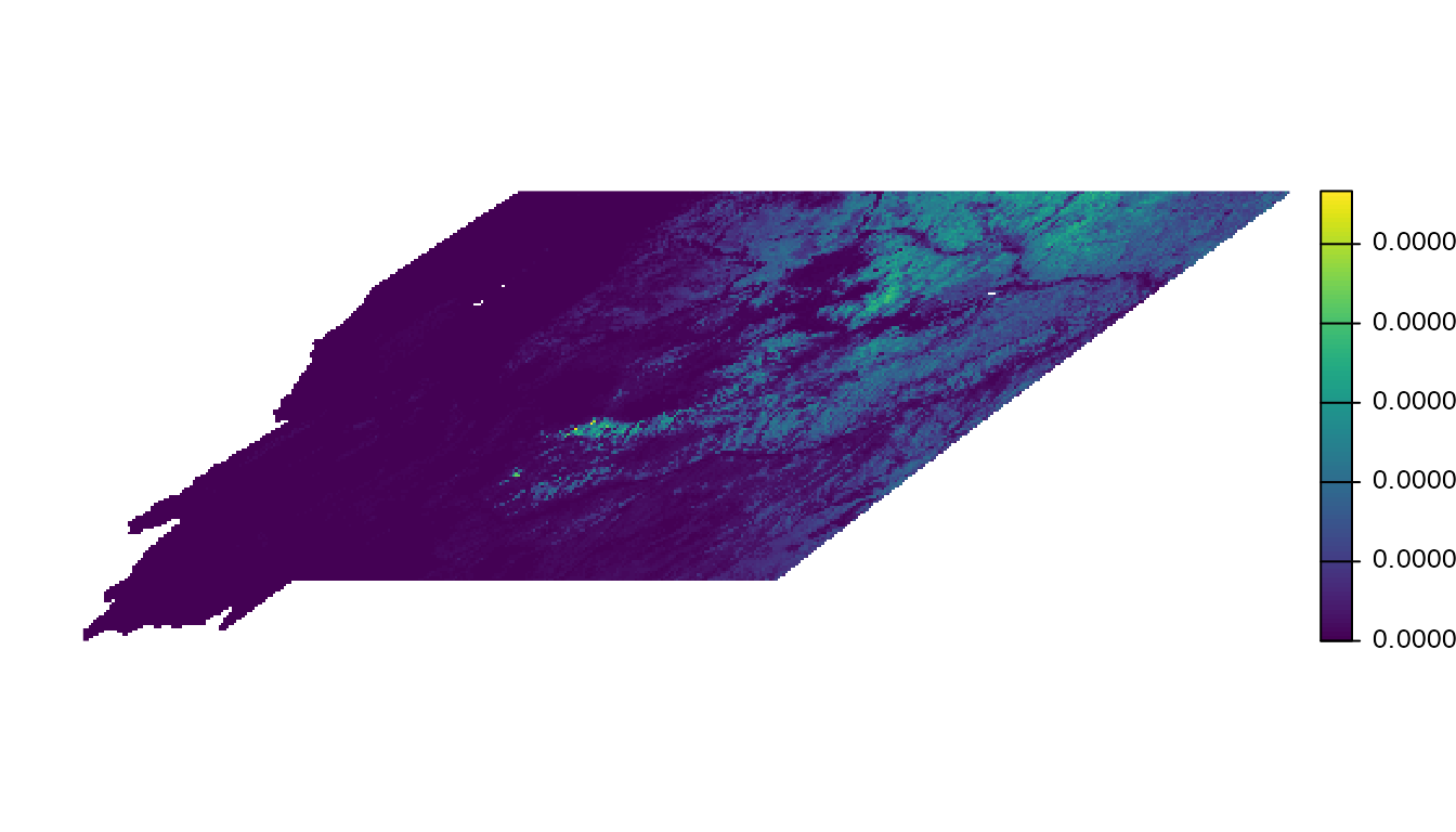
This metric ranges from 0-1 and expresses the mean proportion of the population across the six grassland species within each cell. The raw numeric values are hard to interpret and not particularly meaningful, what’s most important is the relative ranking of cells. We can make the map more useful by removing the zeros as well as small values. We’ll drop all cell values below the median, but depending on your application you may want to chose a different value.
# drop zeros
importance <- ifel(importance == 0, NA, importance)
# drop anything below the median
cutoff <- global(importance, quantile, probs = 0.5, na.rm = TRUE) |>
  as.numeric()
importance <- ifel(importance > cutoff, importance, NA)
# make a simple map
plot(importance, axes = FALSE)
plot(region_boundary, col = "grey", axes = FALSE, add = TRUE)
plot(importance, axes = FALSE, legend = FALSE, add = TRUE)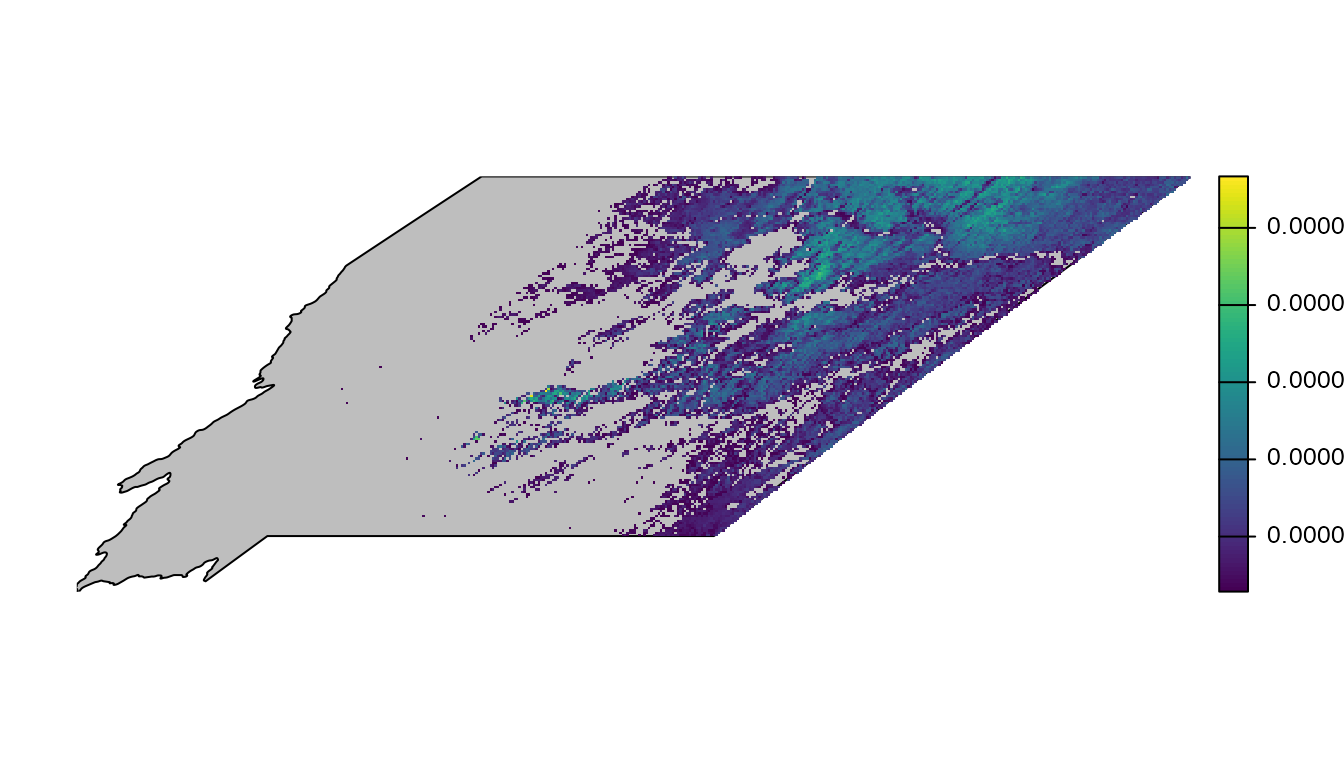
This map does a better job of highlighting the most important areas for grassland birds within Montana. Let’s go one step further and add a better legend and re-project the data using the same region-specific coordinate reference system as we used in the mapping example in this vignette.
# reproject
importance_proj <- trim(project(importance, crs_laea))
region_boundary_proj <- project(region_boundary, crs_laea)
# basemap
par(mar = c(0, 0, 0, 0))
plot(region_boundary_proj, col = "grey", axes = FALSE,
     main = "Areas of importance for grassland birds in Montana")
# add importance raster
plot(importance_proj, legend = FALSE, add = TRUE)
# add legend
fields::image.plot(zlim = c(0, 1), legend.only = TRUE,
                   col = viridisLite::viridis(100),
                   breaks = seq(0, 1, length.out = 101),
                   smallplot = c(0.15, 0.85, 0.12, 0.15),
                   horizontal = TRUE,
                   axis.args = list(at = c(0, 0.5, 1),
                                    labels = c("Low", "Medium", "High"),
                                    fg = "black", col.axis = "black",
                                    cex.axis = 0.75, lwd.ticks = 0.5,
                                    padj = -1.5),
                   legend.args = list(text = "Relative Importance",
                                      side = 3, col = "black",
                                      cex = 1, line = 0))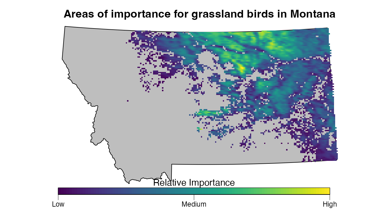
We’ve presented one simple example of identifying priority areas for birds using the eBird Status Data Products; however, this method is quite flexible and can be tailored to your particular use case. At the very least, the focal region, season, and species should be modified for your application. In some cases, species may be present in your focal region throughout the full annual cycle and you may want to consider an importance metric derived by combing multiple seasons of data for each species or using weekly estimates to identify the week of highest importance for each species.
For a more robust approach to this this problem, you may want to use
eBird Status Data Products within the framework of Systematic
Conservation Prioritization. Tools such as the R package prioritizr can be used
in conjunction with the eBird Status Data Products to solve spatial
conservation planning problems with a broad range of objectives and
constraints.
Assessing model performance
Goal: use the spatial predictive performance metrics (PPMs) to assess how model performance varies across the range of a species.
eBird Status and Trends species species are assigned quality scores (0-3) for each season describing the quality of the model predictions across the full range of the species. For example, let’s look at the breeding season quality for Horned Lark.
horlar_review <- filter(ebirdst_runs, species_code == "horlar") |>
  select(breeding_quality, breeding_start, breeding_end)
print(horlar_review)
#> # A tibble: 1 × 3
#>   breeding_quality breeding_start breeding_end
#>   <chr>            <date>         <date>
#> 1 2                2023-06-07     2023-08-09
This score (2) corresponds to “medium quality”, indicating there is some extrapolation or omission in the breeding season predictions. However, Horned Lark is a broadly distributed species, occurring throughout the holarctic realm. Data users are typically interested in model predictions within a particular region, but the quality score gives no indication of where the extrapolation or omission is occurring, only that it occurs somewhere within the range. Someone working with predictions from the Mongolian portion of the range may be dealing with very different prediction quality than someone working with predictions from the part of the range in the Western United States.
While the model quality scores are quite coarse, the spatial
predictive performance metrics (PPMs) available for each species provide
much finer scale information on model quality. For migratory species
like Horned Lark, these data products provide suite of performance
metrics at weekly 27 km resolution. These PPMs are not downloaded by
default by ebirdst_download_status(), but you can download
them with download_ppms = TRUE. Let’s download the PPMs and
load the proportion of the Bernoulli deviance explained metric, which is
typically one of the most useful for assessing model quality.
# download and load ppm
ebirdst_download_status("horlar", download_ppms = TRUE)
bernoulli_dev <- load_ppm("horlar", ppm = "occ_bernoulli_dev")
print(bernoulli_dev)
#> class       : SpatRaster
#> size        : 618, 1276, 52  (nrow, ncol, nlyr)
#> resolution  : 27000, 27000  (x, y)
#> extent      : -17226000, 17226000, -8343000, 8343000  (xmin, xmax, ymin, ymax)
#> coord. ref. : WGS 84 / Equal Earth Greenwich (EPSG:8857)
#> source      : horlar_ppm_occ-bernoulli-dev_mean_27km_2023.tif
#> names       :      01-04,      01-11,      01-18,      01-25,      02-01,      02-08, ...
#> min values  : -1.2016400, -0.3405171, -0.2203241, -0.1847060, -0.1675527, -0.2176256, ...
#> max values  :  0.5162077,  0.5162077,  0.5004212,  0.4199959,  0.4199959,  0.3604106, ...
The data are in the form of a 27 km raster with 52 layers, one for each week of the year. Let’s average these PPMs across the weeks in the breeding season, subset to just the portion of the range within the United States and Canada, and make a map.
# subset to weeks in breeding season and average
breeding_dates <- c(horlar_review$breeding_start, horlar_review$breeding_end) |>
  format("%m-%d")
in_breeding <- names(bernoulli_dev) >= breeding_dates[1] &
  names(bernoulli_dev) <= breeding_dates[2]
bernoulli_dev_breeding <- mean(bernoulli_dev[[in_breeding]], na.rm = TRUE)

# mask to just canada and the united states
us_ca <- ne_countries(country = c("United States of America", "Canada")) |>
  st_transform(st_crs(bernoulli_dev_breeding))
bernoulli_dev_breeding_us_ca <- bernoulli_dev_breeding |>
  crop(us_ca) |>
  mask(us_ca) |>
  trim()

# make a map
ppm_cols <- rev(scico(100, palette = "vik"))
max_val <- global(abs(bernoulli_dev_breeding_us_ca), fun = max, na.rm = TRUE) |>
  as.numeric()
plot(bernoulli_dev_breeding_us_ca,
     range = c(-max_val, max_val),
     col = ppm_cols,
     axes = FALSE, box = TRUE)
plot(st_geometry(us_ca), add = TRUE)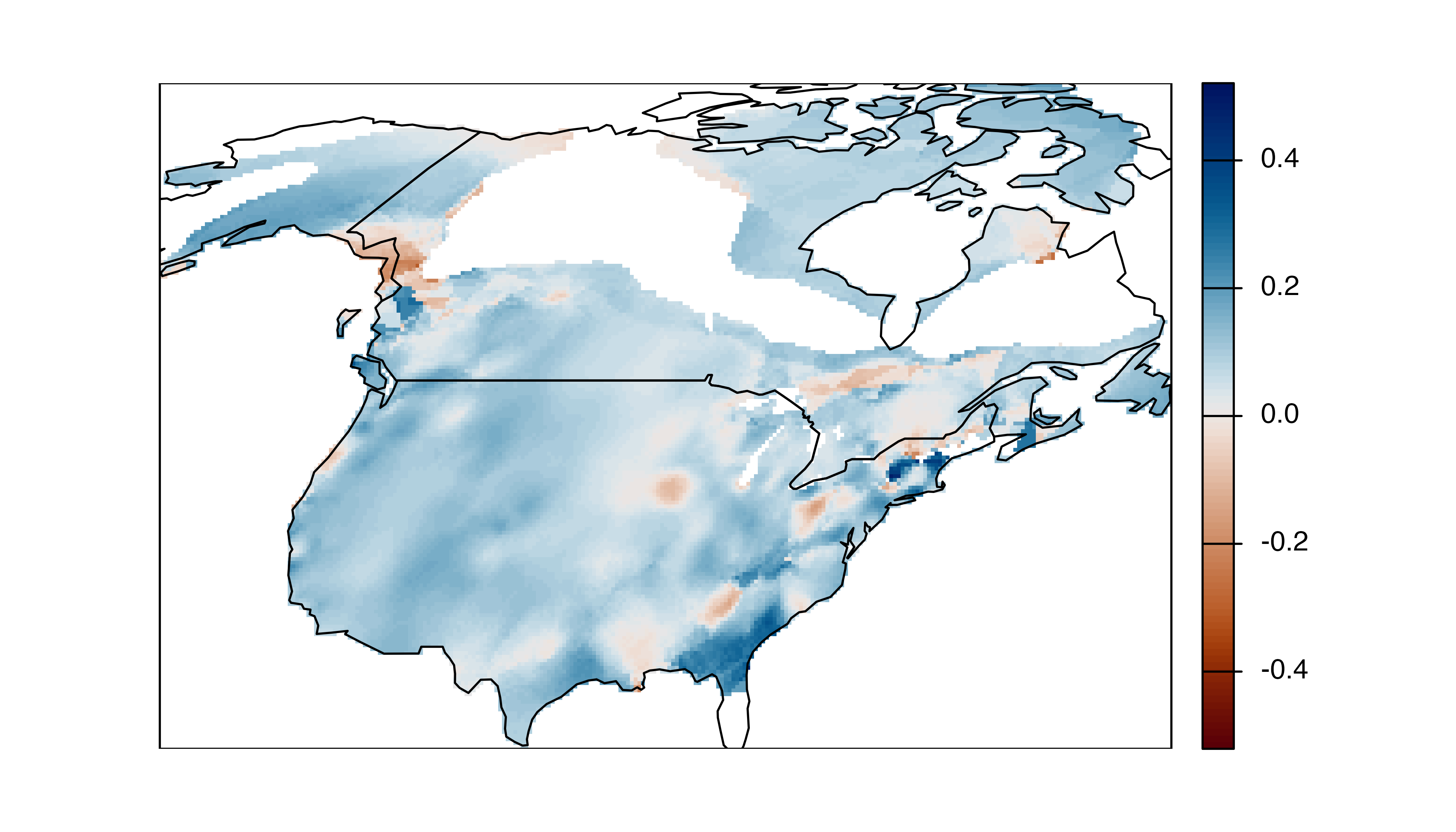
Negative proportions of the deviance explained (red in the above map) indicate that the occurrence model is performing worse than a NULL model and extra caution should be used when using predictions from these areas.