library(arrow)
library(auk)
library(dplyr)
library(ebirdst)
library(fields)
library(forcats)
library(ggplot2)
library(mccf1)
library(ranger)
library(scam)
library(sf)
library(terra)

# set seed for reproducibility
set.seed(1)

# detections
observations <- read_parquet("data/ebird_observations_AU-QLD_2022.parquet") %>%
  filter(species_code == "shbcuc1") %>%
  select(checklist_id, valid, obs_detected, obs_count)

# zero filled checklists
checklists <- read_parquet("data/ebird_checklists_AU-QLD_2022.parquet") %>%
  left_join(observations, by = "checklist_id") %>%
  filter(is.na(valid) | valid) %>%
  mutate(
    # checklist not in the observations dataset are non-detections
    obs_detected = coalesce(obs_detected, 0L),
    # non-detections correspond to a count of 0
    obs_count = ifelse(obs_detected == 1L, obs_count, 0)
)2 Modeling Relative Abundance
In this lesson we’ll estimate encounter rate and relative abundance using eBird data. We define encounter rate as the probability of an eBirder encountering a species on a standard eBird checklist and relative abundance as the expected number of individuals detected on a standard eBird checklist.
The ecological metrics we’re ultimately interested in are probability that a species occurs at a site (i.e. the occupancy probability) and absolute abundance or density of individuals that occur at a site. It’s usually notpossible to estimate these quantities with eBird data because we typically can’t estimate absolute detectability. We can account for much of the variation in detectability by including effort variables in our model and choosing a region and season over which we expect detection effects to be constant. If best practices are followed, encounter rate will be proportional to occupancy and relative abundance proportional to absolute abundance.
The relative abundance model used by eBird Status and Trends, and presented here, is a two-step hurdle model. The first step estimates encounter rate and the second step estimates the expected count of individuals on eBird checklists where the species was detected. Then we multiply encounter rate by median count to produce an estimate of relative abundance. Both steps of the hurdle model use random forests.
As an example, let’s train a relative abundance model using observations of Shining Bronze-Cuckoo in November, December, and January from Queensland.

2.1 Data preparation
Let’s start by reading the eBird data into R and zero-filling it to produce detection/non-detection data for the species.
Next let’s subset the data to only observations from November through January, summer months during which we expect detectability and habitat associations to be stationary. To reduce variation in detectability, we’ll also subset the data to only those checklists less than 6 hours in duration and 10km in length, at speeds below 100km/h, and with 10 or fewer observers. Furthermore, we’ll only consider data from the past 15 years (2008-2022).
checklists <- checklists %>%
  filter(
    # last 15 years of data
    year >= 2008,
    # jan-feb
    (day_of_year >= 305 | day_of_year <= 31),
    # effort filters
    effort_hrs <= 6,
    effort_distance_km <= 10,
    effort_speed_kmph <= 100,
    num_observers <= 10)
For the final filtering step, we’ll use spatial boundaries from Australia’s bioregions to subset the data to the region around Brisbane and the one to the west.
study_region <- read_sf("data/ibra61_reg.gpkg") %>%
  filter((REG_CODE %in% c("SEQ", "BBS")) & STATE == "QLD") %>%
  st_union() %>%
  st_as_sf() %>%
  st_transform(crs = 4326)

# subset to regions of interest
in_region <- checklists %>%
  select(checklist_id, latitude, longitude) %>%
  st_as_sf(coords = c("longitude", "latitude"), crs = 4326) %>%
  st_join(study_region, left = FALSE) %>%
  st_drop_geometry()
checklists <- semi_join(checklists, in_region, by = "checklist_id")
2.1.1 Test-train split
We’ll hold aside a portion of the observations from training to be used as an independent test set to assess the predictive performance of the model. Specifically, we’ll randomly split the data into 80% of observations for training and 20% for testing. To help with this, we create a new variable type that will indicate whether the observation falls in the test set or training set.
checklists$type <- ifelse(runif(nrow(checklists)) <= 0.8, "train", "test")
# confirm the proportion in each set is correct
table(checklists$type) / nrow(checklists)
#>
#>  test train
#> 0.199 0.801
2.1.2 Case controlled grid sampling
Following the method outlined in Section 1.2.3, we perform a round of case controlled grid sampling on the data to reduce spatial and temporal bias as well as class imbalance. We can use the sample_by argument to grid_sample_stratified() to independently sample from the train and test sets to remove bias from both.
checklists_sampled <- grid_sample_stratified(checklists,
                                             obs_column = "obs_detected",
                                             sample_by = "type")
How did this impact the prevalence of detections compared to non-detections?
# original data
nrow(checklists)
#> [1] 54331
count(checklists, obs_detected) %>%
  mutate(percent = n / sum(n))
#> # A tibble: 2 × 3
#>   obs_detected     n percent
#>          <int> <int>   <dbl>
#> 1            0 52379  0.964
#> 2            1  1952  0.0359

# after sampling
nrow(checklists_sampled)
#> [1] 23660
count(checklists_sampled, obs_detected) %>%
  mutate(percent = n / sum(n))
#> # A tibble: 2 × 3
#>   obs_detected     n percent
#>          <int> <int>   <dbl>
#> 1            0 22439  0.948
#> 2            1  1221  0.0516
So, the case controlled sampling decreased the overall number of checklists by a factor of 2.3, but increased the prevalence of detections. This increase in detections will help the random forests model distinguish where birds are being observed; however, this does affect the prevalence rate of the detections in the data. As a result, the estimated encounter rate based on these subsampled data will be larger than the true encounter rate. When examining the outputs from the models it will be important to recall that we altered the prevalence rate at this stage.
2.2 Hurdle model
For this two-step hurdle model, we’ll start by training an random forests model for encounter rate. Then we’ll subset the eBird checklist to only those where the species was detected or predicted to occur by the encounter rate model. We’ll use this subset of the data to train a second random forests model for expected count. Finally we’ll combine the results of the two steps together to produce estimates of relative abundance.
Let’s start by select by removing the 20% of checklists held aside for testing and selecting only those columns we’ll use as response or predictor variables in the models.
checklists_train <- checklists_sampled %>%
  filter(type == "train") %>%
  select(checklist_id,
         obs_detected, obs_count,
         is_stationary,
         year, day_of_year, solar_noon_diff,
         effort_hrs, effort_distance_km, effort_speed_kmph,
         num_observers,
         eastness_1km_median, eastness_1km_sd,
         eastness_90m_median, eastness_90m_sd,
         northness_1km_median, northness_1km_sd,
         northness_90m_median, northness_90m_sd,
         elevation_250m_median, elevation_250m_sd,
         elevation_30m_median, elevation_30m_sd,
         intertidal_c1_ed, intertidal_c1_pland,
         ntl_mean, ntl_sd,
         evi_median, evi_sd,
         starts_with("astwbd"),
         starts_with("road_density"),
         starts_with("mcd12q1"),
         starts_with("gsw"))
2.2.1 Step 1: Encounter rate
For the first step of the hurdle model we’ll train a random forests model to estimate the probability of detection/non-detection of the species, a binary classification problem. Random forests are an excellent, general purpose machine learning method suitable for modeling encounter rate in a wide variety of scenarios.
Most classification algorithms aim to minimize the overall error rate, which results in poor predictive performance for rare classes. To address this issue, we’ll use a balanced random forests approach, a modification of the traditional random forest algorithm designed to handle imbalanced data. In this approach, each of the trees that makes up the random forest is generated using a random sample of the data chosen such that there are an equal number of detections (the rare class) and non-detections (the common class). To use this approach, we’ll need to calculate the proportion of detections in the dataset.
detection_freq <- mean(checklists_train$obs_detected)We’re now ready to train the encounter rate random forests model using the ranger package. Rather than writing out a complete model formula, we’ll use the ~ . notation to instruct the ranger() to use all variables as predictors. We just need to be cautious to remove both checklist_id and obs_count from the data frame. Since this is a classification problem, we also need to convert the response variable (obs_detected) to a factor variable.
train_er <- select(checklists_train, -checklist_id, -obs_count)
er_model <- ranger(formula =  as.factor(obs_detected) ~ .,
                   data = train_er,
                   importance = "impurity",
                   # this ensures ranger predicts class probabilities
                   # not just the most likely class
                   probability = TRUE,
                   # implement a balanced random forests
                   replace = TRUE,
                   sample.fraction = c(detection_freq, detection_freq))
2.2.1.1 Calibrating
Predicted probabilities from a random forests model do not always line up with the observed frequency of detection. We’ll address this mismatch using model calibration, which aligns the estimated probabilities to the observed frequencies. In particular, to calibrate our model results, we predict encounter rate for each checklist in the training set, then fit a binomial Generalized Additive Model (GAM) with the real observations as the response and the predicted encounter rate as the predictor variable.
# predicted encounter rate and observed detection
obs_pred <- tibble(obs = train_er$obs_detected,
                   pred = er_model$predictions[, 2])

# fit calibration model
calibration_model <- scam(obs ~ s(pred, k = 6, bs = "mpi"),
                          gamma = 2,
                          data = obs_pred)
To use the calibration model as a diagnostic tool, we’ll group the predicted encounter rates into bins, then calculate the mean predicted and observed encounter rates within each bin. This can be compared to predictions from the calibration model.
# group the predicted encounter rate into bins of width 0.02
# then calculate the mean observed encounter rates in each bin
er_breaks <- seq(0, 1, by = 0.02)
mean_er <- obs_pred %>%
  mutate(er_bin = cut(pred, breaks = er_breaks, include.lowest = TRUE)) %>%
  group_by(er_bin) %>%
  summarise(n_checklists = n(),
            pred = mean(pred),
            obs = mean(obs),
            .groups = "drop")

# make predictions from the calibration model
cal_pred <- data.frame(pred = er_breaks)
cal_pred <- predict(calibration_model, cal_pred, type = "response") %>%
  bind_cols(cal_pred, calibrated = .)

# compared binned mean encounter rates to calibration model
ggplot(cal_pred) +
  aes(x = pred, y = calibrated) +
  geom_abline(slope = 1, intercept = 0, linetype = "dashed") +
  geom_line(color = "blue") +
  geom_point(data = mean_er,
             aes(x = pred, y = obs),
             size = 2, alpha = 0.6,
             show.legend = FALSE) +
  labs(x = "Estimated encounter rate",
       y = "Observed encounter rate",
       title = "Calibration model") +
  coord_equal(xlim = c(0, 1), ylim = c(0, 1))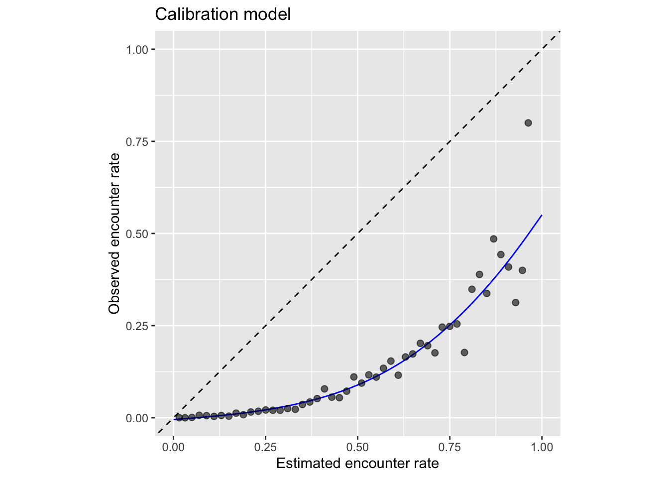
From this plot we can clearly see that the estimated encounter rates are mostly much larger than the observed encounter rates (all points fall below the dashed line). So we see that the model is not well calibrated. However, we do see from the points that the relative ranking of predictions is largely good: sites with estimated higher encounter rate do mostly have higher observed encounter rates.
If you’re using this model to calibrate your estimates, notice that the calibration curve can produce probabilities greater than 1 and less than 0, so when applying the calibration we also need to restrict the predictions to be between 0 and 1. It’s possible to run a logistic regression for the calibration to remove these predictions less than 0 or greater than 1; however, we’ve found the Gaussian constrained GAM to be more stable than the logistic constrained GAM.
2.2.1.2 Thresholding
The random forest model produces continuous estimates of encounter rate from 0-1. However, for many applications, including selecting which observations are included in the next stage of the hurdle, we’ll need to reclassify this continuous probability to a binary presence/absence estimate. This reclassification is done by setting a threshold above which the species is predicted to be absent. We recommend selecting a threshold using the MCC-F1 curve, which performs well for class imbalanced data. The R package mccf1 implements this method.
# mcc and fscore calculation for various thresholds
mcc_f1 <- mccf1(response = obs_pred$obs, predictor = obs_pred$pred)

# identify best threshold
mcc_f1_summary <- summary(mcc_f1)
#>  mccf1_metric best_threshold
#>         0.337          0.625
threshold <- mcc_f1_summary$best_threshold[1]
2.2.2 Step 2: Count
For the second step of the hurdle model, we train a random forests model to estimate the expected count of individuals on eBird checklists where the species was detected or predicted to be detected by the encounter rate model. So, we’ll start by subsetting the data to just these checklists. In addition, we’ll remove any observations for which the observer reported that species was present, but didn’t report a count of the number of individuals (coded as a count of “X” in the eBird database, but converted to NA in our dataset).
# attach the predicted encounter rate
# we'll use this to include checklists that are predicted to be above the threshold
train_count <- checklists_train
train_count$pred_er <- er_model$predictions[, 2]
# subset to only observed or predicted detections
train_count <- train_count %>%
  filter(!is.na(obs_count),
         obs_count > 0 | pred_er > threshold) %>%
  select(-checklist_id, -obs_detected, -pred_er)
We’ve found that including estimated encounter rate as a predictor in the count model improves predictive performance. So, with this in mind, we predict encounter rate for the training dataset and add it as an additional column.
predicted_er <- predict(er_model, data = train_count, type = "response")
predicted_er <- predicted_er$predictions[, 2]
train_count$predicted_er <- predicted_er
Finally, we train a random forests model to estimate count. This is superficially very similar to the random forests model for encounter rate; however, for count we’re using a regression random forest while for encounter rate we used a balanced classification random forest.
count_model <- ranger(formula = obs_count ~ .,
                      data = train_count,
                      importance = "impurity",
                      replace = TRUE)
2.2.3 Assessment
To assess the quality of the encounter rate, count, and relative abundance models, we’ll validate the their ability to predict the observed patterns of detection and counts using independent validation data (i.e. the 20% test data set). There are a range of predictive performance metrics (PPMs) that can be used to compare the predictions to the actual observations. We’ll start by estimating encounter rate, count, and relative abundance for the spatiotemporally grid sampled test dataset.
# get the test set held out from training
checklists_test <- filter(checklists_sampled, type == "test")

# estimate encounter rate for test data
pred_er <- predict(er_model, data = checklists_test, type = "response")
# extract probability of detection
pred_er <- pred_er$predictions[, 2]
# convert to binary using the threshold
pred_binary <- as.integer(pred_er > threshold)
# calibrate
pred_calibrated <- predict(calibration_model,
                           newdata = data.frame(pred = pred_er),
                           type = "response") %>%
  as.numeric()
# constrain probabilities to 0-1
pred_calibrated <- pmin(pmax(pred_calibrated, 0), 1)

# add predicted encounter rate required for count estimates
checklists_test$predicted_er <- pred_er
# estimate count
pred_count <- predict(count_model, data = checklists_test, type = "response")
pred_count <- pred_count$predictions

# relative abundance is the product of encounter rate and count
pred_abundance <- pred_calibrated * pred_count

# combine all estimates together
obs_pred_test <- data.frame(
  id = seq_along(pred_abundance),
  # actual detection/non-detection
  obs_detected = checklists_test$obs_detected,
  obs_count = checklists_test$obs_count,
  # model estimates
  pred_binary = pred_binary,
  pred_er = pred_calibrated,
  pred_count = pred_count,
  pred_abundance = pred_abundance
)
First we’ll calculate a suite of PPMs for the encounter rate model.
# mean squared error (mse)
mse <- mean((obs_pred_test$obs_detected - obs_pred_test$pred_er)^2,
            na.rm = TRUE)

# spearman correlation, based on in range observations only
spearman <- cor(obs_pred_test$pred_er[obs_pred_test$pred_binary > 0],
                obs_pred_test$obs_detected[obs_pred_test$pred_binary > 0],
                method = "spearman")

# precision-recall auc
em <- precrec::evalmod(scores = obs_pred_test$pred_binary,
                       labels = obs_pred_test$obs_detected)
pr_auc <- precrec::auc(em) %>%
  filter(curvetypes == "PRC") %>%
  pull(aucs)

# calculate metrics for binary prediction: kappa, sensitivity, specificity
pa_metrics <- obs_pred_test %>%
  select(id, obs_detected, pred_binary) %>%
  PresenceAbsence::presence.absence.accuracy(na.rm = TRUE, st.dev = FALSE)

# mcc and f1
mcc_f1 <- calculate_mcc_f1(obs_pred_test$obs_detected,
                           obs_pred_test$pred_binary)

# combine metrics together
ppms <- tibble(
  mse = mse,
  spearman = spearman,
  sensitivity = pa_metrics$sensitivity,
  specificity = pa_metrics$specificity,
  kappa = pa_metrics$Kappa,
  pr_auc = pr_auc,
  mcc = mcc_f1$mcc,
  f1 = mcc_f1$f1
)
knitr::kable(ppms, digits = 3)| mse | spearman | sensitivity | specificity | kappa | pr_auc | mcc | f1 |
|---|---|---|---|---|---|---|---|
| 0.037 | 0.19 | 0.524 | 0.896 | 0.222 | 0.129 | 0.259 | 0.271 |
The count and abundance predictive performance metrics are measures of within range performance, meaning we compare observed count vs. estimated count and abundance only for those checklists where the model predicts the species to occur.
# subset to only those checklists where detection is predicted
detections_test <- filter(obs_pred_test,
                          pred_binary > 0,
                          !is.na(obs_count))

# count metrics
count_spearman <- cor(detections_test$pred_count,
                      detections_test$obs_count,
                      method = "spearman")
log_count_pearson <- cor(log(detections_test$pred_count + 1),
                         log(detections_test$obs_count + 1),
                         method = "pearson")

# abundance metrics
abundance_spearman <- cor(detections_test$pred_abundance,
                          detections_test$obs_count,
                          method = "spearman")
log_abundance_pearson <- cor(log(detections_test$pred_abundance + 1),
                             log(detections_test$obs_count + 1),
                             method = "pearson")

# combine metrics together
ppms <- tibble(
  count_spearman = count_spearman,
  log_count_pearson = log_count_pearson,
  abundance_spearman = abundance_spearman,
  log_abundance_pearson = log_abundance_pearson
)
knitr::kable(ppms, digits = 3)| count_spearman | log_count_pearson | abundance_spearman | log_abundance_pearson |
|---|---|---|---|
| 0.23 | 0.22 | 0.242 | 0.213 |
Let’s take a moment to consider these predictive performance metrics. How would the importance of different metrics change based on your intended application?
2.3 Habitat associations
From the random forest model, we can glean two important sources of information about the association between species detection and features of their local environment. First, predictor importance is a measure of the predictive power of each variable used as a predictor in the model, and is calculated as a byproduct of fitting a random forests model. Second, partial dependence estimates the marginal effect of one predictor holding all other predictors constant.
2.3.1 Predictor importance
During the process of training a random forests model, some variables are removed at each node of the trees that make up the random forests. Predictor importance is based on the mean decrease in accuracy of the model when a given predictor is not used. It’s technically an average Gini index, but essentially larger values indicate that a predictor is more important to the model. First, we can look at the predictor importances for the encounter rate model.
pi_er <- er_model$variable.importance
pi_er <- data.frame(predictor = names(pi_er), importance = unname(pi_er)) %>%
  arrange(desc(importance))
# plot top 10 predictors
ggplot(head(pi_er, 10)) +
  aes(x = fct_reorder(predictor, importance), y = importance) +
  geom_col() +
  geom_hline(yintercept = 0, linewidth = 2, colour = "#555555") +
  scale_y_continuous(expand = c(0, 0)) +
  coord_flip() +
  labs(x = NULL,
       y = "Predictor Importance (Gini Index)") +
  theme_minimal() +
  theme(panel.grid = element_blank(),
        panel.grid.major.x = element_line(colour = "#cccccc", linewidth = 0.5))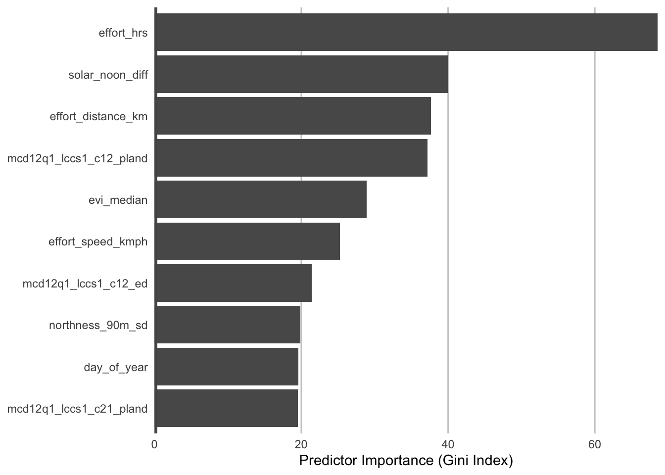
Second, we can look at the predictor importances for the count model.
pi_count <- count_model$variable.importance
pi_count <- data.frame(predictor = names(pi_count), importance = unname(pi_count)) %>%
  arrange(desc(importance))
# plot top 10 predictors
ggplot(head(pi_count, 10)) +
  aes(x = fct_reorder(predictor, importance), y = importance) +
  geom_col() +
  geom_hline(yintercept = 0, linewidth = 2, colour = "#555555") +
  scale_y_continuous(expand = c(0, 0)) +
  coord_flip() +
  labs(x = NULL,
       y = "Predictor Importance (Gini Index)") +
  theme_minimal() +
  theme(panel.grid = element_blank(),
        panel.grid.major.x = element_line(colour = "#cccccc", linewidth = 0.5))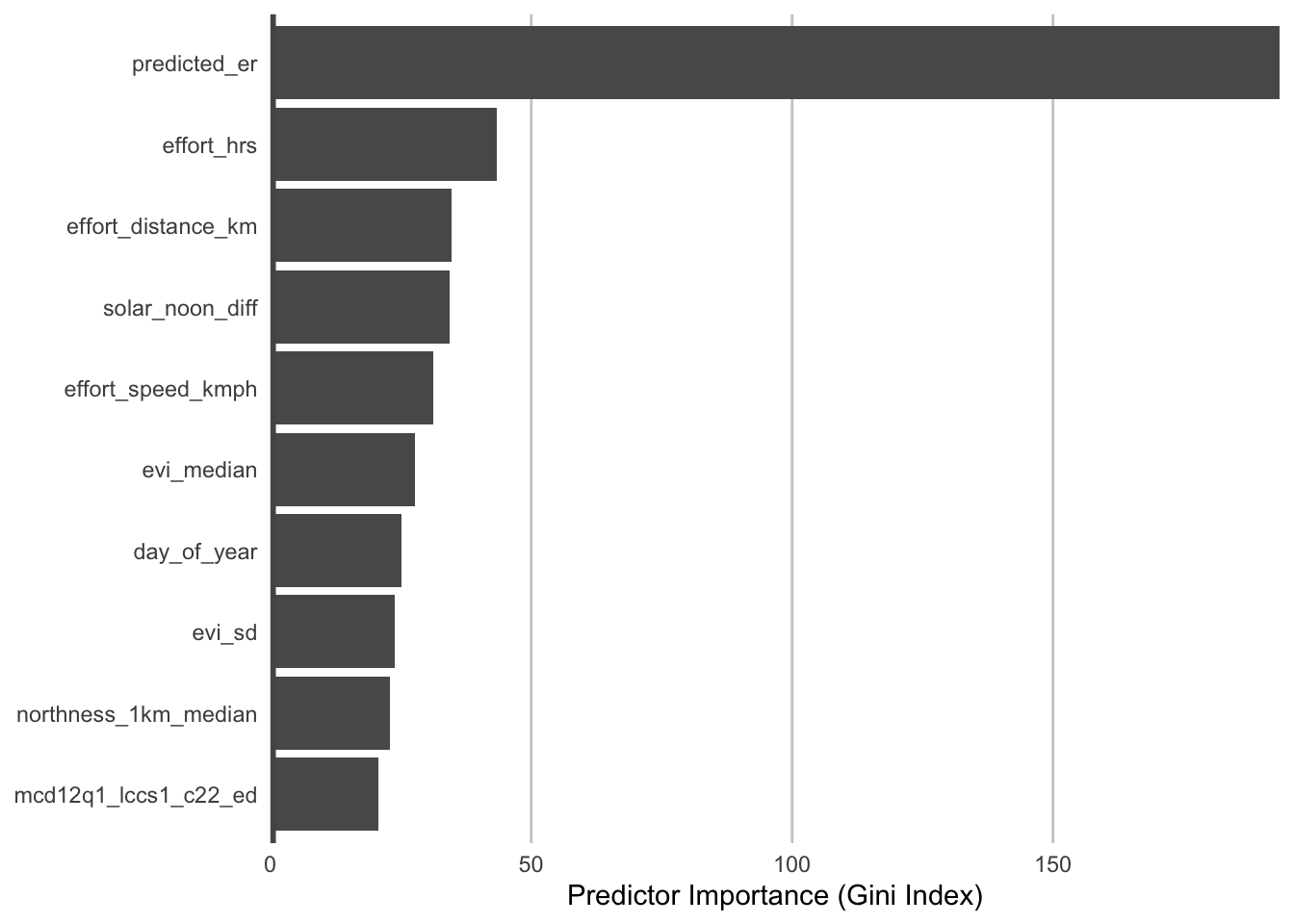
The most important predictors of detection/non-detection are often effort variables. Indeed, that’s the case here: checklist duration, distance traveled, and time of day (solar_noon_diff) all appear in the top 5 predictors. This is not surprising: going out at the right time of day and expending more effort searching will lead to a higher probability of detecting most birds. Focusing on the habitat variables, evergreen broadleaf forest and open forest are in the top 10. Note however, that high importance doesn’t tell us the direction of the relationship with detection, for that we’ll have to look at partial dependence plots.
2.3.2 Partial dependence
Partial dependence plots show the marginal effect of a given predictor on relative abundance averaged across the other predictors. These plots are generated by predicting relative abundance at a regular sequence of points across the full range of values of a given predictor. At each predictor value, predictions of relative abundnace are made for a random subsample of the training dataset with the focal predictor fixed, but all other predictors left as is. The relative abundance predictions are then averaged across all the checklists in the training dataset giving an estimate of the average relative abundance at a specific value of the focal predictor. This is a cumbersome process, but we provide a function below that does all the hard work for you! This function takes the following arguments:
predictor: the name of the predictor to calculate partial dependence forer_model: the encounter rate model objectcount_model: the count model objectcal_model: the calibration model objectdata: the original data used to train the modelx_res: the resolution of the grid over which to calculate the partial dependence, i.e. the number of points between the minimum and maximum values of the predictor to evaluate partial dependence atn: number of points to subsample from the training data
# function to calculate partial dependence for a single predictor
calculate_pd <- function(predictor, er_model, count_model, cal_model, data,
                         x_res = 25, n = 1000) {
  # create prediction grid using quantiles
  x_grid <- quantile(data[[predictor]],
                     probs = seq(from = 0, to = 1, length = x_res),
                     na.rm = TRUE)
  # remove duplicates
  x_grid <- x_grid[!duplicated(signif(x_grid, 8))]
  x_grid <- unname(unique(x_grid))
  grid <- data.frame(predictor = predictor, x = x_grid)
  names(grid) <- c("predictor", predictor)

  # subsample training data
  n <- min(n, nrow(data))
  data <- data[sample(seq.int(nrow(data)), size = n, replace = FALSE), ]

  # drop focal predictor from data
  data <- data[names(data) != predictor]
  grid <- merge(grid, data, all = TRUE)

  # predict
  p_er <- predict(er_model, data = grid)
  grid$predicted_er <- p_er$predictions[, 2]
  p_count <- predict(count_model, data = grid)

  # summarize
  pd <- grid[, c("predictor", predictor)]
  names(pd) <- c("predictor", "x")
  pd$encounter_rate <- p_er$predictions[, 2]
  pd$count <- p_count$predictions

  er_cal <- stats::predict(cal_model, newdata = tibble(pred = pd$encounter_rate),
                       type = "response")
  er_cal[er_cal < 0] <- 0
  er_cal[er_cal > 1] <- 1
  pd$er_cal <- er_cal

  pd$relative_abundance <- pd$er_cal * pd$count
  pd <- dplyr::group_by(pd, predictor, x) %>%
    dplyr::summarise(relative_abundance = mean(relative_abundance, na.rm = TRUE),
                     .groups = "drop")

  return(pd)
}
Now we’ll use this function to calculate partial dependence for the top six predictor variables.
# calculate partial dependence for each predictor
# map is used to iteratively apply calculate_pd to each predictor
pd <- NULL
for (predictor in head(pi_er$predictor)) {
  pd <- calculate_pd(predictor, er_model = er_model, count_model = count_model,
                     cal_model = calibration_model, data = checklists_train) %>%
    bind_rows(pd, .)
}

# plot
ggplot(pd) +
  aes(x = x, y = relative_abundance) +
  geom_line() +
  geom_point() +
  facet_wrap(~ as_factor(predictor), ncol = 2, scales = "free") +
  labs(x = NULL, y = "Relative Abundnace") +
  theme_minimal() +
  theme_minimal() +
  theme(panel.grid = element_blank(),
        axis.line = element_line(color = "grey60"),
        axis.ticks  = element_line(color = "grey60"))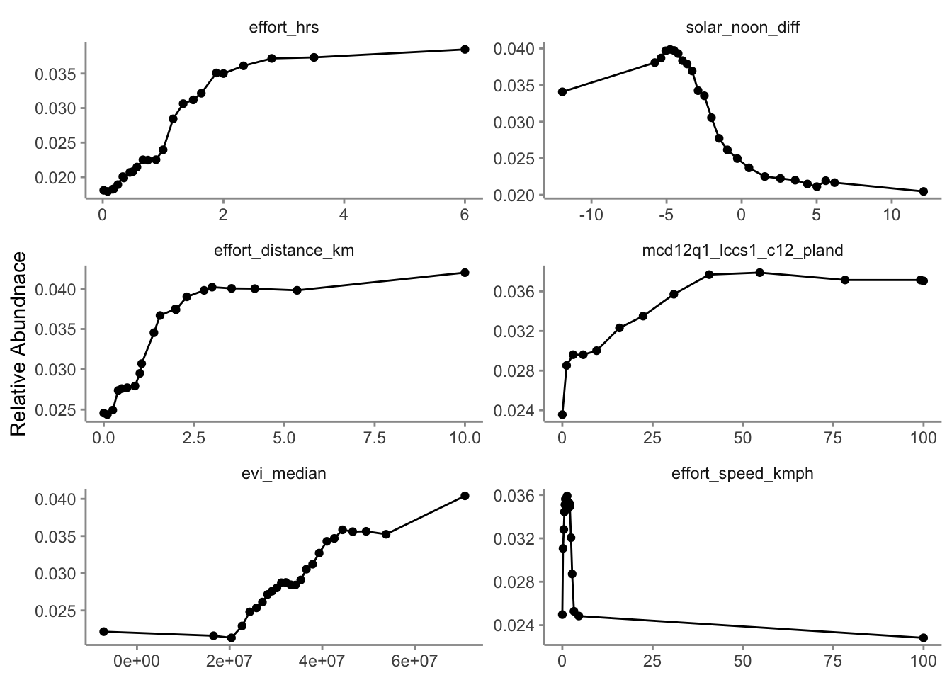
Consider the relationships shown in the partial dependence plots in light of your knowledge of the species. Do these relationships make sense.
2.4 Prediction
Using the prediction grid described in Section 1.2.2, we can estimate relative abundance over our entire study area. First we estimate encounter rate and count, then we multiply these together to get an estimate of relative abundance. Let’s read in the prediction grid and subset to just the region we’re focusing on.
pred_grid_year <- read_parquet("data/prediction-grid_year_AU-QLD_2022.parquet")

pred_grid_evi <- read_parquet("data/prediction-grid_week_AU-QLD_2022.parquet") %>%
  filter(day_of_year == 347) %>%
  select(srd_id, evi_median, evi_sd)

pred_grid_all <- pred_grid_year %>%
  left_join(pred_grid_evi, by = "srd_id")

raster_template <- rast("data/prediction-grid_template.tif") %>%
  # crop raster to study region
  crop(st_transform(study_region, crs = crs(.)))

# subset to the three regions we're focusing on
in_region <- pred_grid_all %>%
  select(srd_id, latitude, longitude) %>%
  st_as_sf(coords = c("longitude", "latitude"), crs = 4326) %>%
  st_join(study_region, left = FALSE) %>%
  st_drop_geometry()
pred_grid <- semi_join(pred_grid_all, in_region, by = "srd_id")
The prediction grid only includes values for the environmental variables, so to make predictions we’ll need to add effort variables to this prediction grid. We’ll make predictions for a standard eBird checklist: a 2 km, 1 hour traveling count at the peak time of day for detecting this species. Finally, we’ll make these predictions for December 15, 2022, the middle of our November-January focal window for the latest year for which we have eBird data.
To find the time of day with the highest detection probability, we can look for the peak of the partial dependence plot.
# estimate a partial dependence plot for solar noon diff
pd_time <- calculate_pd("solar_noon_diff",
                        er_model = er_model,
                        count_model = count_model,
                        cal_model = calibration_model,
                        data = checklists_train) %>%
  select(solar_noon_diff = x, relative_abundance)

# partial dependence plot
ggplot(pd_time) +
  aes(x = solar_noon_diff, y = relative_abundance) +
  geom_line() +
  geom_point() +
  scale_x_continuous(breaks = seq(-12, 13, by = 3)) +
  labs(x = "Difference from solar noon",
       y = "Relative Abundance",
       title = "Partial dependence") +
  theme_bw()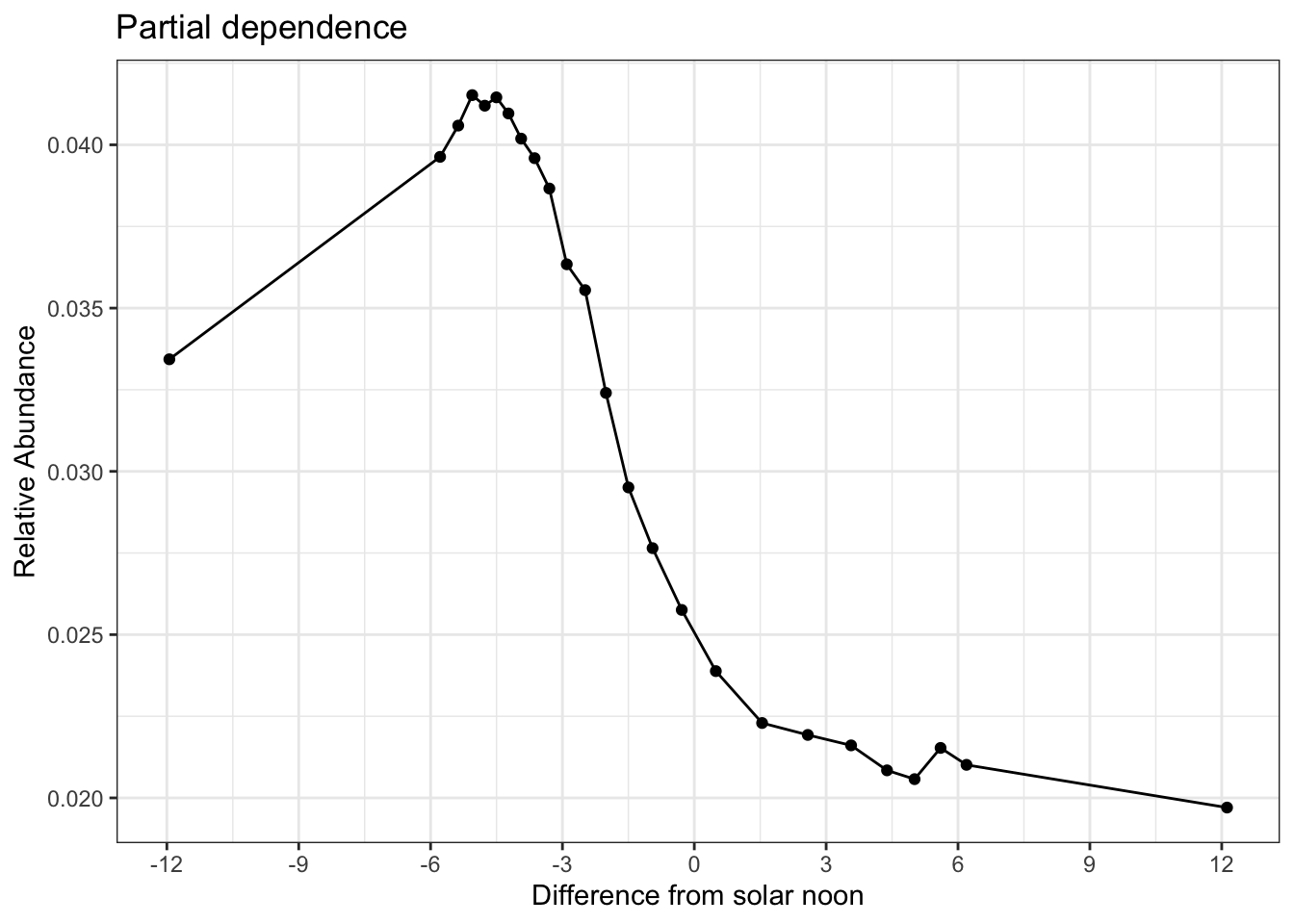
Based on the above plot, it appears that about 5 hours before solar noon is the optimal time. We could stop here and set the rest of our prediction values to fixed units, but there is significant value in defining these prediction units differently for our estimates of range boundary (presence/absence). Think of this as two different searches. First, a search goes out for as long (time and distance) as it takes to detect the species in all places (maximized detection). Then a separate search goes out for a standardized amount of duration and distance. In this way, we get the best range boundary possible combined with standardized estimates of encounter rate, count, and relative abundance within that range boundary. To maximize the effort units for predicting the range boundary, we’ll need to look at the peaks of the partials for these predictors as well.
# estimate a partial dependence plot for effort_hrs
pd_hrs <- calculate_pd("effort_hrs",
                        er_model = er_model,
                        count_model = count_model,
                        cal_model = calibration_model,
                        data = checklists_train) %>%
  select(effort_hrs = x, relative_abundance)

# partial dependence plot
ggplot(pd_hrs) +
  aes(x = effort_hrs, y = relative_abundance) +
  geom_line() +
  geom_point() +
  scale_x_continuous(breaks = seq(0, 6, by = 1)) +
  labs(x = "Effort Hours",
       y = "Relative Abundance",
       title = "Partial dependence") +
  theme_bw()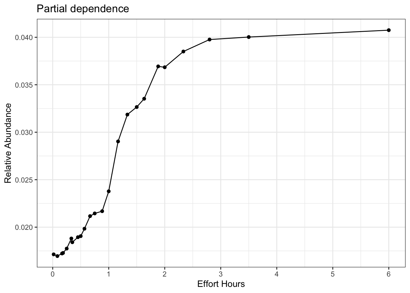
Here we see a slope that doesn’t stop asymptoting until we get to 6 hours. However, that value of six hours is the last quantile and represents potential extrapolation territory, so we’ll chose the second to last quantile (which isn’t that different) at 3.5 hours.
# estimate a partial dependence plot for effort_distance_km
pd_km <- calculate_pd("effort_distance_km",
                        er_model = er_model,
                        count_model = count_model,
                        cal_model = calibration_model,
                        data = checklists_train) %>%
  select(effort_distance_km = x, relative_abundance)

# partial dependence plot
ggplot(pd_km) +
  aes(x = effort_distance_km, y = relative_abundance) +
  geom_line() +
  geom_point() +
  scale_x_continuous(breaks = seq(0, 10, by = 1)) +
  labs(x = "Effort Distance (km)",
       y = "Relative Abundance",
       title = "Partial dependence") +
  theme_bw()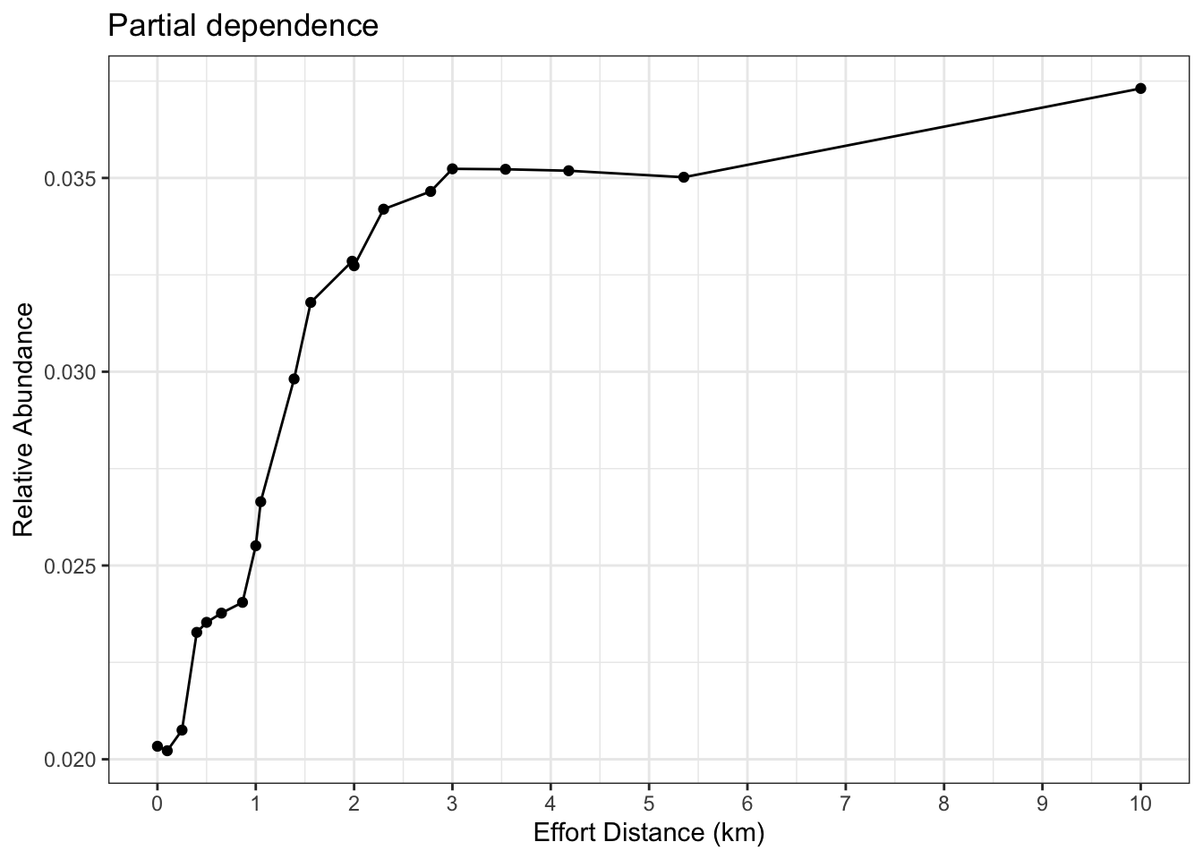
Again, here the last quantile value is way out at 10 and could generate extrapolation, so we’ll choose 5.5 km, the next quantile value. We also need to remember that we have effort_speed_kmph as a predictor in the model. Let’s generate a partial for this, to see if 5.5 km / 3.5 hours produces a reasonable value.
# estimate a partial dependence plot for rate
pd_km <- calculate_pd("effort_speed_kmph",
                        er_model = er_model,
                        count_model = count_model,
                        cal_model = calibration_model,
                        data = checklists_train) %>%
  select(effort_speed_kmph = x, relative_abundance)

# partial dependence plot
ggplot(pd_km) +
  aes(x = effort_speed_kmph, y = relative_abundance) +
  geom_line() +
  geom_point() +
  geom_vline(xintercept = 5.5 / 3.5, col = "red") +
  #scale_x_continuous(breaks = seq(0, 6, by = 1)) +
  xlim(c(0, 5)) +
  labs(x = "Effort Speed (km/h))",
       y = "Relative Abundance",
       title = "Partial dependence") +
  theme_bw()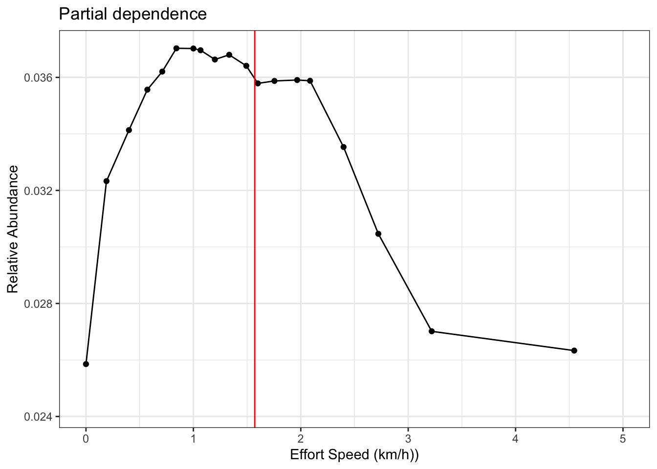
This looks good. It’s not the absolute peak of the rate partial, but it’s pretty close, especially given the magnitude of the range for this partial. Let’s add all the effort variables to the prediction grid.
pred_grid_eff <- pred_grid %>%
  mutate(year = 2022,
         day_of_year = 349,
         solar_noon_diff = -5,
         is_stationary = 0,
         effort_hrs = 3,
         effort_distance_km = 5,
         effort_speed_kmph = 5.5 / 3,
         num_observers = 1)
First, we’ll estimate binary presence/absence of the range boundary with an encounter rate prediction using these maximized effort values. Then we’ll reset the effort values the more standardized values of 1 hour, 2 km, and 2 kmph. These values are close to the means and medians of the data distribution. After we’ve reset these effort values, we’ll estimate calibrated encounter rate, count, and abundance for each point on the prediction grid.
# binary presence/absence
pred_binary_er <- predict(er_model, data = pred_grid_eff, type = "response")
pred_binary_er <- pred_binary_er$predictions[, 2]
pred_binary <- as.integer(pred_binary_er > threshold)

# set prediction values for effort back to standardized values
pred_grid_eff$effort_hrs <- 1
pred_grid_eff$effort_distance_km <- 2
pred_grid_eff$effort_speed_kmph <- 2

# encounter rate estimate
pred_er <- predict(er_model, data = pred_grid_eff, type = "response")
pred_er <- pred_er$predictions[, 2]

# apply calibration
pred_er_cal <- predict(calibration_model,
                       data.frame(pred = pred_er),
                       type = "response") %>%
  as.numeric()

# add predicted encounter rate required for count estimates
pred_grid_eff$predicted_er <- pred_er
# count estimate
pred_count <- predict(count_model, data = pred_grid_eff, type = "response")
pred_count <- pred_count$predictions

# add estimates to prediction grid
predictions <- pred_grid_eff %>%
  select(srd_id, latitude, longitude) %>%
  bind_cols(in_range = pred_binary,
            encounter_rate = pred_er_cal,
            count = pred_count) %>%
  mutate(encounter_rate = pmin(pmax(encounter_rate, 0), 1),
         abundance = pred_er_cal * pred_count)
Next, we convert these estimates to raster format using the raster template.
r_pred <- predictions %>%
  # convert to spatial features
  st_as_sf(coords = c("longitude", "latitude"), crs = 4326) %>%
  st_transform(crs = crs(raster_template)) %>%
  # rasterize
  rasterize(raster_template,
            field = c("in_range", "encounter_rate", "count", "abundance"),
            fun = mean) %>% # throws an error without
  setNames(c("in_range", "encounter_rate", "count", "abundance"))
# trim global raster to study region
r_pred <- trim(r_pred)
Prior to mapping these predictions, let’s load some contextual GIS data and project everything to a more suitable coordinate reference system.
# load and project gis data
map_proj <- "+proj=laea +lon_0=146.95 +lat_0=-19.15 +datum=WGS84 +units=m +no_defs"
ne_land <- read_sf("data/gis-data.gpkg", "ne_land") %>%
  st_transform(crs = map_proj) %>%
  st_geometry()
ne_country_lines <- read_sf("data/gis-data.gpkg", "ne_country_lines") %>%
  st_transform(crs = map_proj) %>%
  st_geometry()
ne_state_lines <- read_sf("data/gis-data.gpkg", "ne_state_lines") %>%
  st_transform(crs = map_proj) %>%
  st_geometry()
study_region_proj <- st_transform(study_region, crs = map_proj) %>%
  st_geometry()

# project the raster data
r_pred_proj <- crop(r_pred, st_transform(study_region, crs(r_pred))) %>%
  project(map_proj, method = "near")
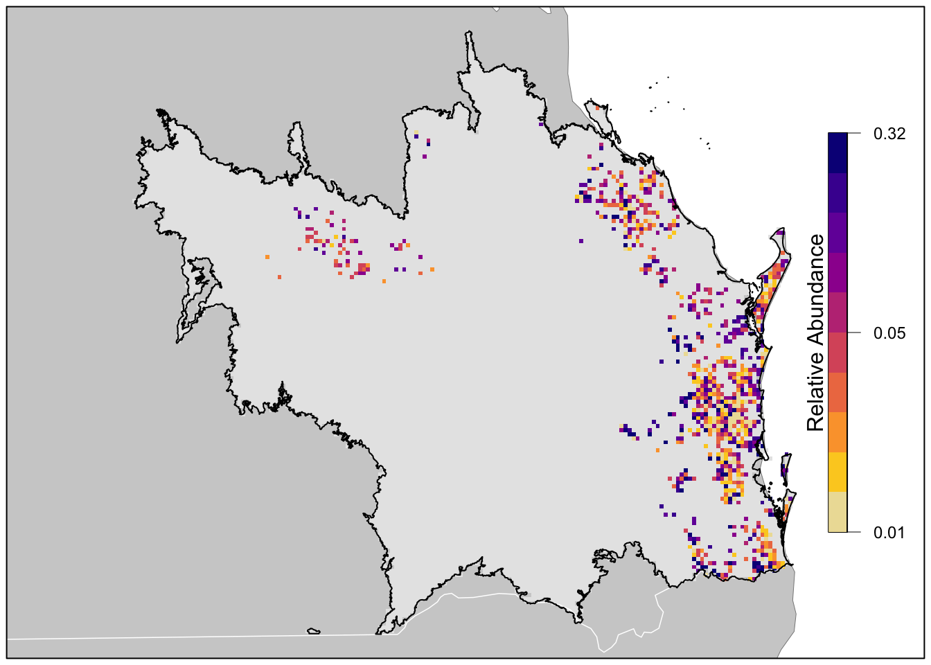
Finally we’ll produce a map of relative abundance. The values shown on this map are the expected number of birds seen by an average eBirder conducting a 2 hour, 1 km checklist on December 15, 2022 at the optimal time of day for detecting the species. Prior to mapping the relative abundance, we’ll multiple by the in_range layer, which will produce a map showing zero relative abundance where the model predicts that the species does not occur.
# in range abundance
r_plot <- r_pred_proj[["abundance"]] * r_pred_proj[["in_range"]]

par(mar = c(0.25, 0.25, 0.25, 0.25))
# set up plot area
plot(study_region_proj, col = NA, border = NA)
plot(ne_land, col = "#cfcfcf", border = "#888888", lwd = 0.5, add = TRUE)

# define quantile breaks, excluding zeros
brks <- ifel(r_plot > 0, r_plot, NA) %>%
  global(fun = quantile,
         probs = seq(0, 1, 0.1), na.rm = TRUE) %>%
  as.numeric() %>%
  unique()
# label the bottom, middle, and top value
lbls <- round(c(min(brks), median(brks), max(brks)), 2)
# ebird status and trends color palette
pal <- ebirdst_palettes(n = length(brks) - 1, type = "weekly")
plot(r_plot,
     col = c("#e6e6e6", pal), breaks = c(0, brks),
     maxpixels = ncell(r_plot),
     legend = FALSE, axes = FALSE, bty = "n",
     add = TRUE)

# borders
plot(ne_state_lines, col = "#ffffff", lwd = 0.75, add = TRUE)
plot(ne_country_lines, col = "#ffffff", lwd = 1.5, add = TRUE)
plot(study_region_proj, border = "#000000", col = NA, lwd = 1, add = TRUE)
box()

# legend
image.plot(zlim = c(0, 1), legend.only = TRUE,
           col = pal, breaks = seq(0, 1, length.out = length(brks)),
           smallplot = c(0.89, 0.91, 0.2, 0.8),
           horizontal = FALSE,
           axis.args = list(at = c(0, 0.5, 1), labels = lbls,
                            fg = "black", col.axis = "black",
                            cex.axis = 0.75, lwd.ticks = 0.5),
           legend.args = list(text = "Relative Abundance",
                              side = 2, col = "black",
                              cex = 1, line = 0))